Home > DU Pride Logo
DU Pride Logo
Redesigning the logo for the Duisburg Association DU Pride e.V.
Skills and tools used in this project:
Visual Composition
Brand Design
Brand Consistency
Figma
Adobe Illustrator
Adobe After Effects
Challenge
In the past, the association had another name and not a proper Brand. For 2024, DU Pride e.V. wanted to redesign their visual identity and make it clear it belongs to the german city of Duisburg. The association is responsible to take the lead and host the CSD (Christopher Street Day), the annual event celebrated worldwide to promote LGBTQ+ rights.

Brand presence
The old and poorly logos made throughout the years did not reflect the mission or didn’t even pop out from other association logos from other cities, so the new logo should reflect the mission and city it belongs
Exploration phase
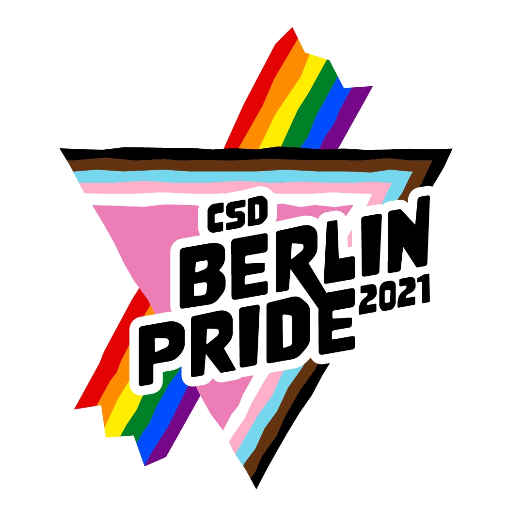
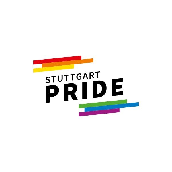
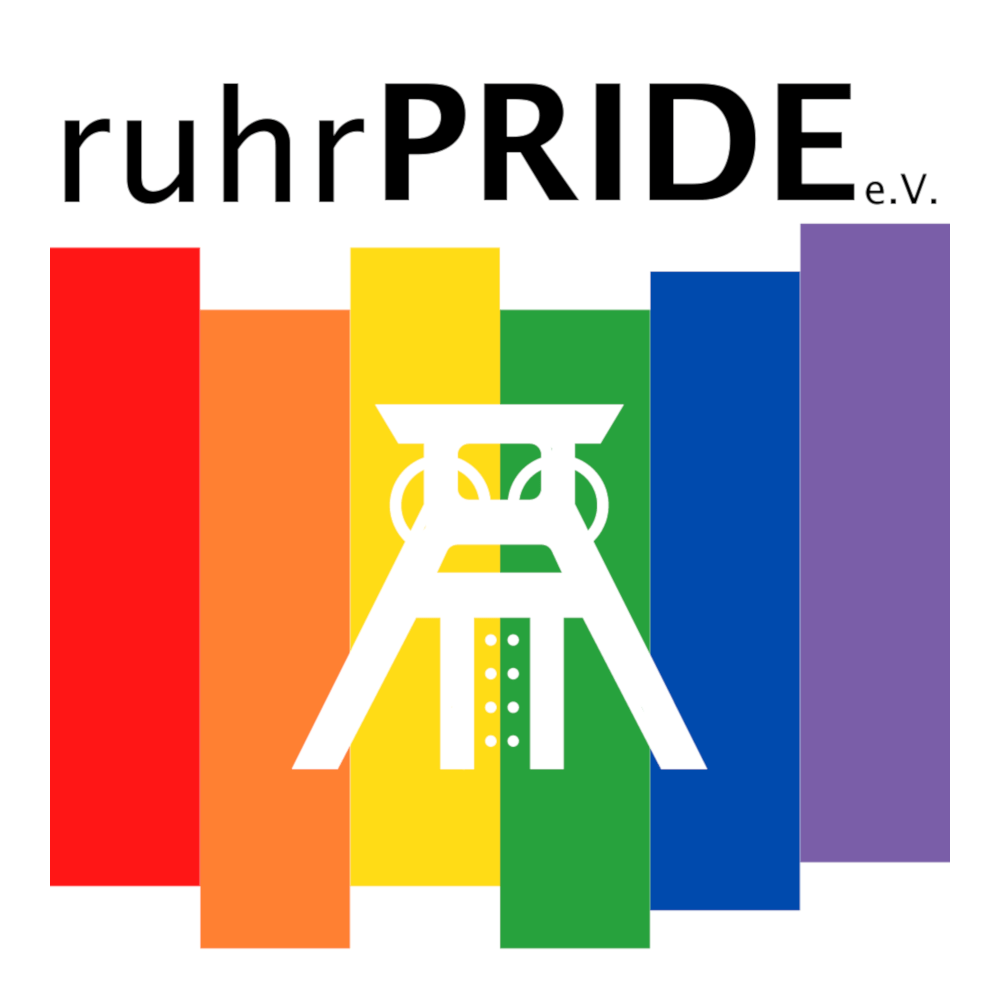
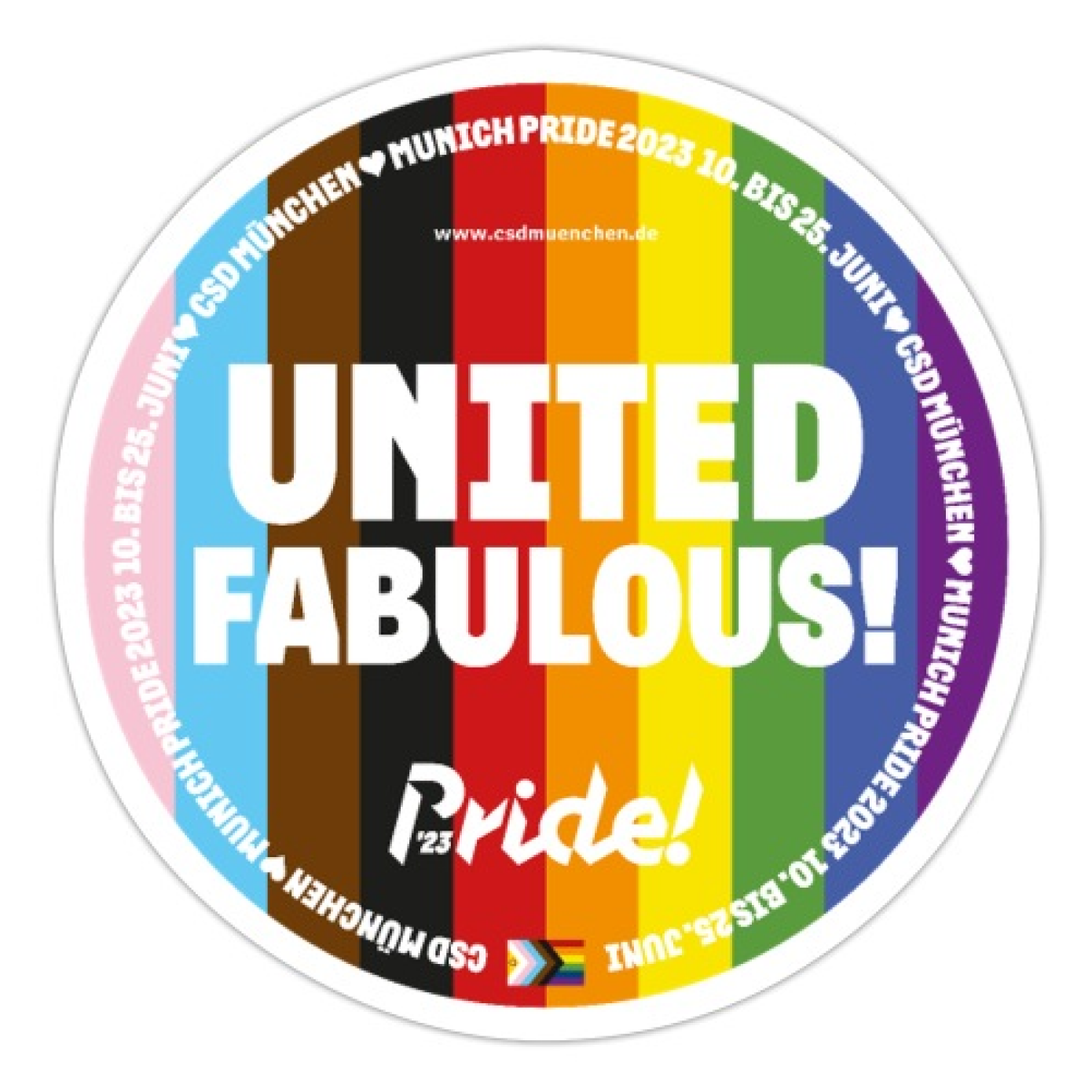
For starters, it was crucial to familiarize myself with different associations within Germany and what kind of logo they used. They were simple, but very clear, although none of them quite reflected their city - So all of them looked very similar.
I came across two challenges:

Duisburg included
As other logos have no specific element to reflect their cities, this was an opportunity to look up for something that could make this logo unique and clear from where it comes from.

Pride colours included
It was very important and crucial to have the Pride flag somewhere and make it inclusive enough, as today we have many flag variations that could contain more than 13 colours.
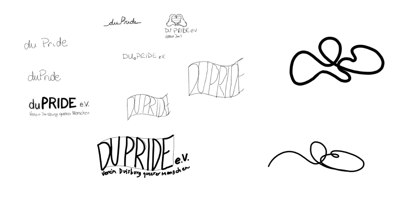
Sketch phase
Between sketches and research, this sculpture came across:
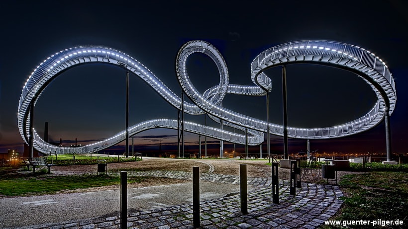
Tiger & Turtle - Magic Mountain is a sculpture and public art installation in Duisburg, Germany. It is not a traditional staircase but a spiral sculpture resembling a roller coaster. Created by artists Heike Mutter and Ulrich Genth, the artwork was unveiled in 2011. The structure provides visitors with a unique perspective of the urban landscape and has become a popular attraction in Duisburg.
After my research about this sculpture, I was decided to use it, somehow.
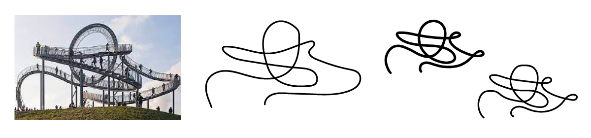
It was hard to get the right angle of the Duisburg sculpture and make the lines being harmonic and simple, making sure the essence of the art was still recognizable in the logo. After a few attempts, there was a certain angle in the picture that allowed me to get the right balance on my sketch.
I knew I had something special coming out of the Tiger & Turtle sculpture, but as a good and professional designer, I couldn't let me get too attached to something I personally liked. So I tried to open my mind to other options.
The Flag Option
This draft presents a bold typography, creating the feeling of being proud of who you are.
The colors and angle creates the illusion of a waving flag. The angle also shows that the community is not part of a rigid/conservative society, but it breaks the rules. Instead of “Du”, we use “Duisburg”, as there’s no reason to have a short version of the name.Why try to avoid the obvious? People easily recognizes the pride flag, and the right association to the logo is made. This approach was the safest option. The fonts used here were Archivo.
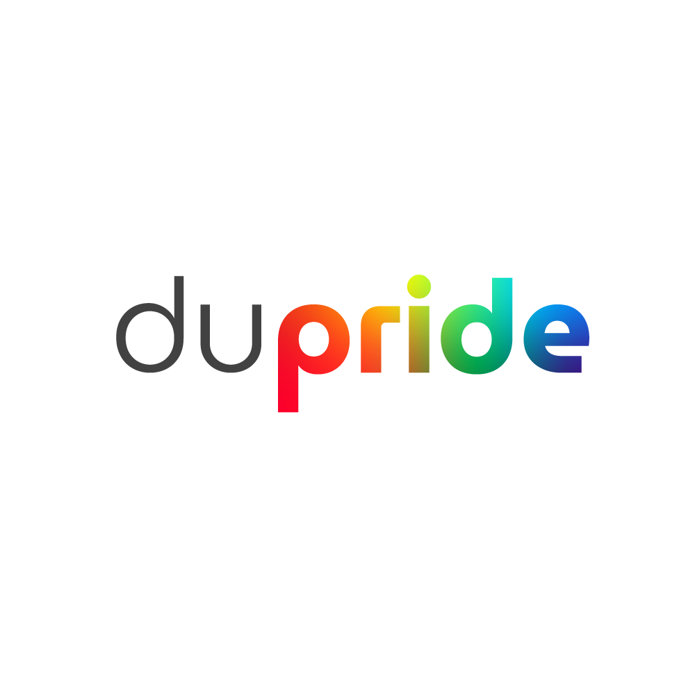
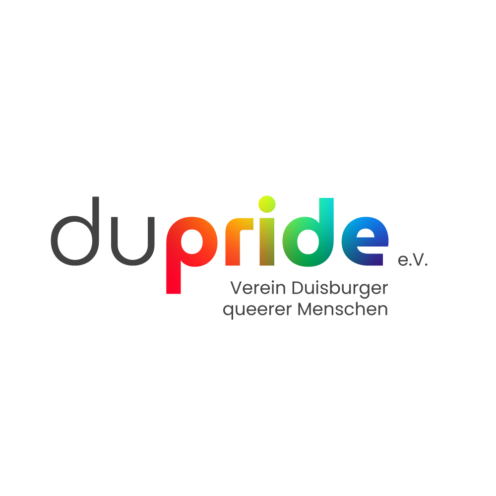
The Typography Option
DU Pride is the brand design's name dream. It's short and strong, which makes it easy to come up with lots of ideas.So in this approach I tried to explore using the typography, as the strength of the logo is in the name.
So as you can see, the focus comes back to the name - the flag colours are represented inside “pride“. The font used here creates a perfect balance reflected on the “D’s” and “P“. It is a short logo, perfect for applications on all sorts of media.
The fonts used here were MuseoModerno and NanumGothic.
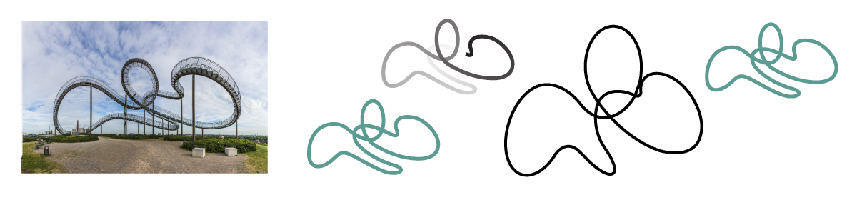
The Tiger & Turtle Option
Inspired by the Tiger & Turtle in Duisburg . Based on the fun and dynamic shapes of Tiger & Turtle, the logo contains a very unique symbol of the city combined on a gradient colors of the pride flag. The fonts used here were MuseoModerno.
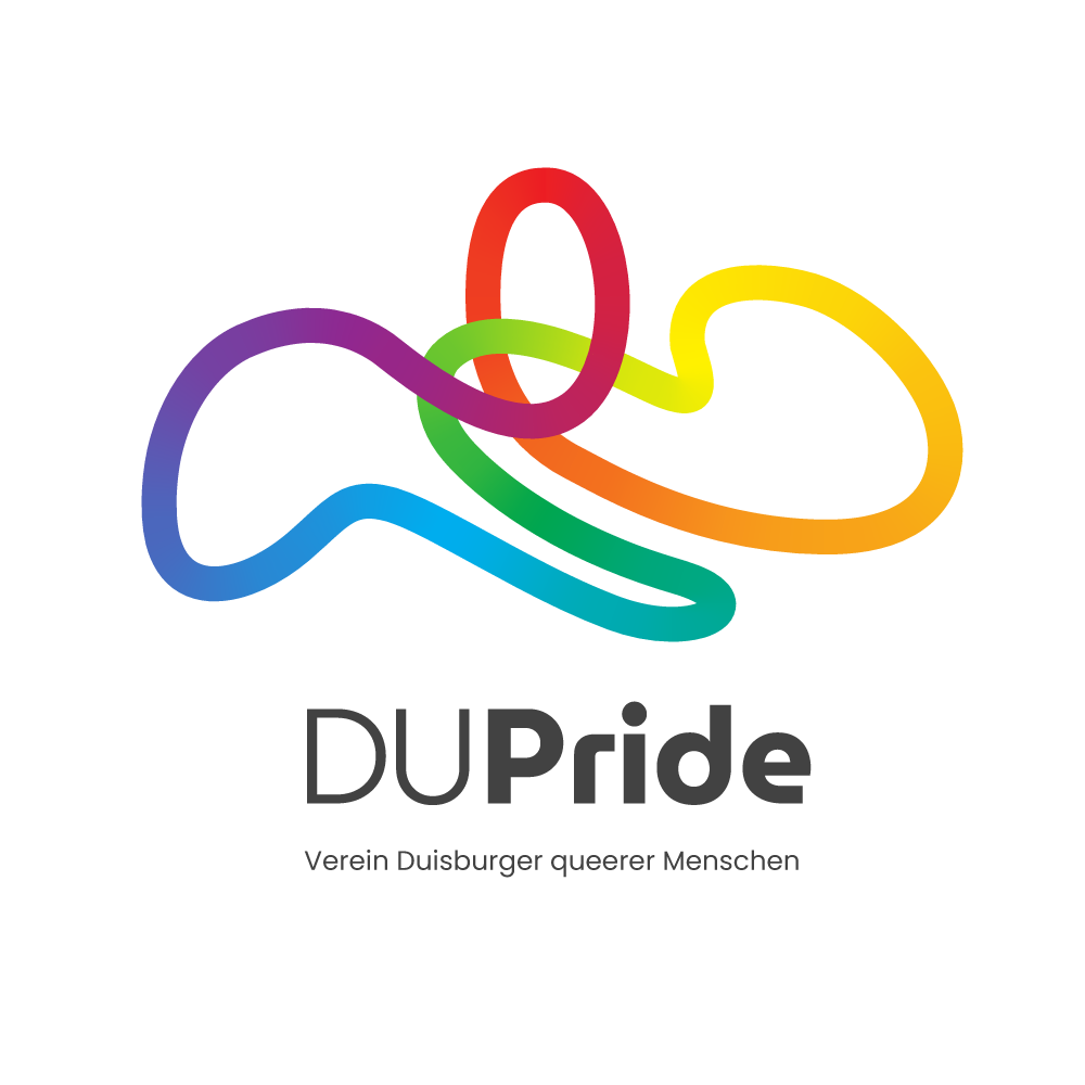
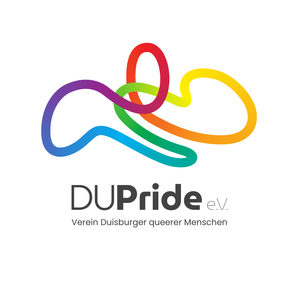
The community connection in a loop, symbolising that support comes from each other - filled with pride. Everyone has their own story and their own trajectory - that’s why this logo is not “symmetrical“, but has different curves, in different directions - but they’re all connected.
The typography also has more curves (matching the graphic) and is unique.
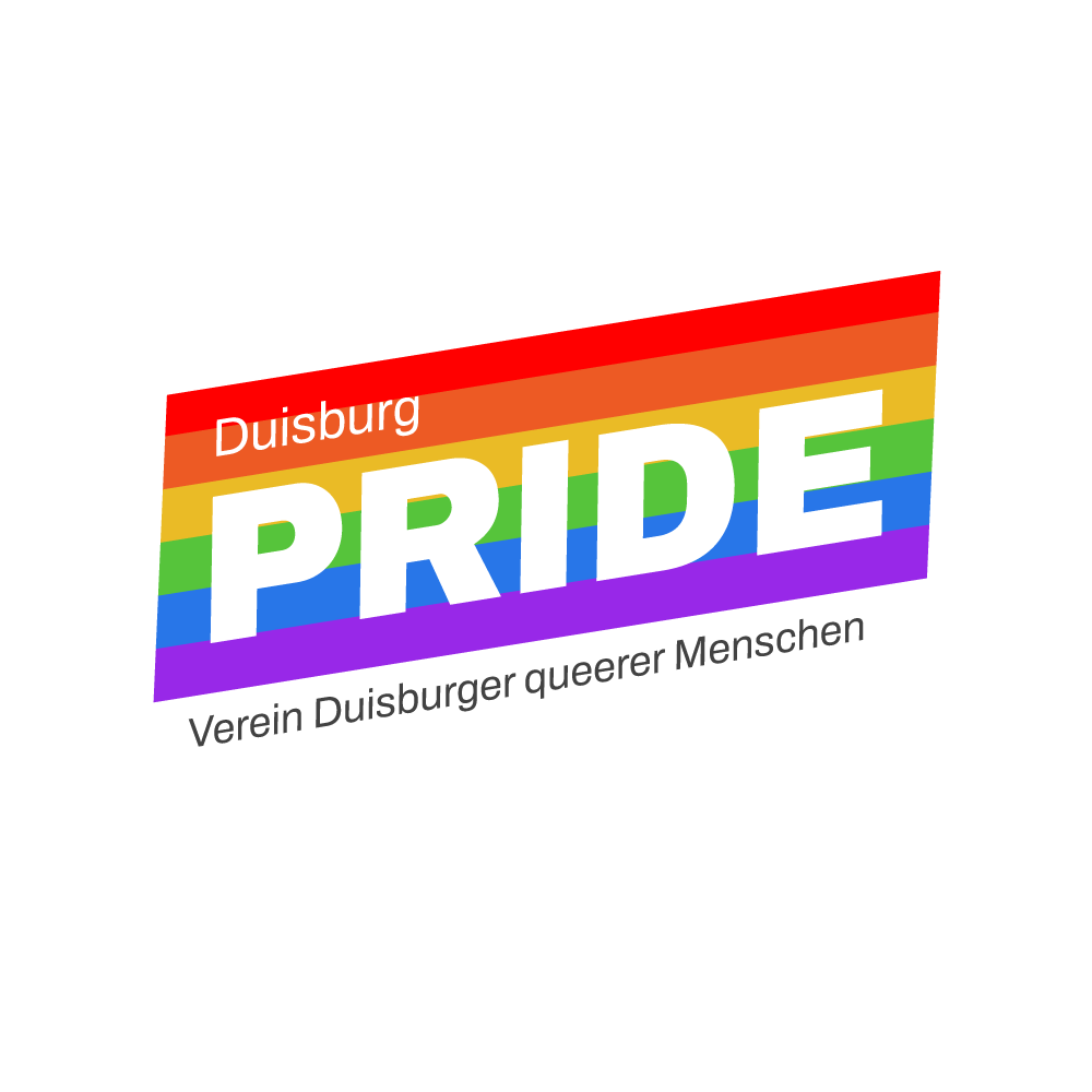
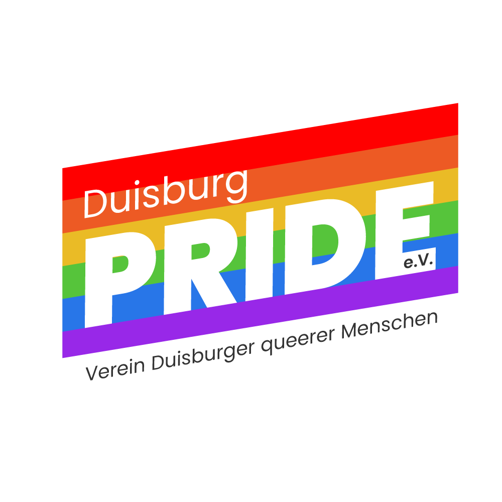
Tiger & Turtle Option was the favourite approach
After the presentation, the logos were sent to the association and they agreed on using the Tiger & Turtle option.

Did you like
this project?
Contact me!
I'd love to hear about your vision and explore how we can work together.
Let’s have a chat and find out if we’re a match!


Check out other projects
Made with lots of ☕ and 💖 • © 2025 Rebeca Natalie

Home > DU Pride Logo
DU Pride Logo
Redesigning the logo for the Duisburg Association DU Pride e.V.
Skills and tools used in this project:
Visual Composition
Brand Design
Brand Consistency
Figma
Adobe Illustrator
Adobe After Effects
Challenge
In the past, the association had another name and not a proper Brand. For 2024, DU Pride e.V. wanted to redesign their visual identity and make it clear it belongs to the german city of Duisburg. The association is responsible to take the lead and host the CSD (Christopher Street Day), the annual event celebrated worldwide to promote LGBTQ+ rights.
Brand presence
The old and poorly logos made throughout the years did not reflect the mission or didn’t even pop out from other association logos from other cities, so the new logo should reflect the mission and city it belongs
Exploration phase
For starters, it was crucial to familiarize myself with different associations within Germany and what kind of logo they used. They were simple, but very clear, although none of them quite reflected their city - So all of them looked very similar.
I came across two challenges:
Duisburg included
As other logos have no specific element to reflect their cities, this was an opportunity to look up for something that could make this logo unique and clear from where it comes from.
Pride colours included
It was very important and crucial to have the Pride flag somewhere and make it inclusive enough, as today we have many flag variations that could contain more than 13 colours.
Sketch phase
Between sketches and research, this sculpture came across:
Tiger & Turtle - Magic Mountain is a sculpture and public art installation in Duisburg, Germany. It is not a traditional staircase but a spiral sculpture resembling a roller coaster. Created by artists Heike Mutter and Ulrich Genth, the artwork was unveiled in 2011. The structure provides visitors with a unique perspective of the urban landscape and has become a popular attraction in Duisburg.
After my research about this sculpture, I was decided to use it, somehow.
It was hard to get the right angle of the Duisburg sculpture and make the lines being harmonic and simple, making sure the essence of the art was still recognizable in the logo. After a few attempts, there was a certain angle in the picture that allowed me to get the right balance on my sketch.
I knew I had something special coming out of the Tiger & Turtle sculpture, but as a good and professional designer, I couldn't let me get too attached to something I personally liked. So I tried to open my mind to other options.
The Flag Option
This draft presents a bold typography, creating the feeling of being proud of who you are.
The colors and angle creates the illusion of a waving flag. The angle also shows that the community is not part of a rigid/conservative society, but it breaks the rules. Instead of “Du”, we use “Duisburg”, as there’s no reason to have a short version of the name.Why try to avoid the obvious? People easily recognizes the pride flag, and the right association to the logo is made. This approach was the safest option. The fonts used here were Archivo.
The Typography Option
DU Pride is the brand design's name dream. It's short and strong, which makes it easy to come up with lots of ideas.So in this approach I tried to explore using the typography, as the strength of the logo is in the name.
So as you can see, the focus comes back to the name - the flag colours are represented inside “pride“. The font used here creates a perfect balance reflected on the “D’s” and “P“. It is a short logo, perfect for applications on all sorts of media.
The fonts used here were MuseoModerno and NanumGothic.
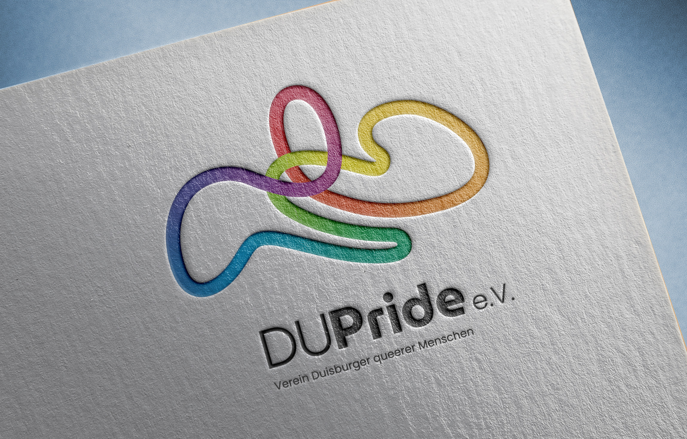
The Tiger & Turtle Option
Inspired by the Tiger & Turtle in Duisburg . Based on the fun and dynamic shapes of Tiger & Turtle, the logo contains a very unique symbol of the city combined on a gradient colors of the pride flag. The fonts used here were MuseoModerno.
The community connection in a loop, symbolising that support comes from each other - filled with pride. Everyone has their own story and their own trajectory - that’s why this logo is not “symmetrical“, but has different curves, in different directions - but they’re all connected.
The typography also has more curves (matching the graphic) and is unique.
Tiger & Turtle Option was the favourite approach
After the presentation, the logos were sent to the association and they agreed on using the Tiger & Turtle option.
Did you like this project? Contact me!
I'd love to hear about your vision and explore how we can work together.
Let’s have a chat and find out if we’re a match!
Check out other projects
Made with lots of ☕ and 💖 • © 2025 Rebeca Natalie
Home > DU Pride Logo
DU Pride Logo
Redesigning the logo for the Duisburg Association DU Pride e.V.
Skills and tools used in this project:
Visual Composition
Brand Design
Graphic Design
Figma
Adobe Illustrator
Adobe After Effects
Challenge
In the past, the association had another name and not a proper Brand. For 2024, DU Pride e.V. wanted to redesign their visual identity and make it clear it belongs to the german city of Duisburg. The association is responsible to take the lead and host the CSD (Christopher Street Day), the annual event celebrated worldwide to promote LGBTQ+ rights.
Brand presence
The old and poorly logos made throughout the years did not reflect the mission or didn’t even pop out from other association logos from other cities, so the new logo should reflect the mission and city it belongs
Exploration phase
For starters, it was crucial to familiarise myself with different associations within Germany and what kind of logo they used. They were simple, but very clear, although none of them quite reflected their city - So all of them looked very similar and not very special.
I came across two challenges:
Duisburg included
As other logos have no specific element to reflect their cities, this was an opportunity to look up for something that could make this logo unique and clear from where it comes from.
Pride colours included
It was very important and crucial to have the Pride flag somewhere and make it inclusive enough, as today we have many flag variations that could contain more than 13 colours.
Sketch phase
Between sketches and research, this sculpture came across:
Tiger & Turtle - Magic Mountain is a sculpture and public art installation in Duisburg, Germany. It is not a traditional staircase but a spiral sculpture resembling a roller coaster. Created by artists Heike Mutter and Ulrich Genth, the artwork was unveiled in 2011. The structure provides visitors with a unique perspective of the urban landscape and has become a popular attraction in Duisburg.
After my research about this sculpture, I was decided to use it, somehow.
It was hard to get the right angle of the Duisburg sculpture and make the lines being harmonic and simple, making sure the essence of the art was still recognisable in the logo. After a few attempts, there was a certain angle in the picture that allowed me to get the right balance on my sketch.
Although it looked like a good potential logo already, I kept working on different designs so the client could have options to pick from. At the end, I came up with three options:
The Flag Option
This draft presents a bold typography, creating the feeling of being proud of who you are.
The colors and angle creates the illusion of a waving flag. The angle also shows that the community is not part of a rigid/conservative society, but it breaks the rules. Instead of “Du”, we use “Duisburg”, as there’s no reason to have a short version of the name.Why try to avoid the obvious? People easily recognizes the pride flag, and the right association to the logo is made. This approach was the safest option. The fonts used here were Archivo.
The Typography Option
DU Pride is the brand design's name dream. It's short and strong, which makes it easy to come up with lots of ideas.So in this approach I tried to explore using the typography, as the strength of the logo is in the name.
So as you can see, the focus comes back to the name - the flag colours are represented inside “pride“. The font used here creates a perfect balance reflected on the “D’s” and “P“. It is a short logo, perfect for applications on all sorts of media.
The fonts used here were MuseoModerno and NanumGothic.
The Tiger & Turtle Option
Inspired by the Tiger & Turtle in Duisburg . Based on the fun and dynamic shapes of Tiger & Turtle, the logo contains a very unique symbol of the city combined on a gradient colors of the pride flag. The fonts used here were MuseoModerno.
The community connection in a loop, symbolising that support comes from each other - filled with pride. Everyone has their own story and their own trajectory - that’s why this logo is not “symmetrical“, but has different curves, in different directions - but they’re all connected.
The typography also has more curves (matching the graphic) and is unique.
Tiger & Turtle Option was the favourite approach
After the presentation, the logos were sent to the association and they agreed on using the Tiger & Turtle option.
Did you like this project? Contact me!
I'd love to hear about your vision and explore how we can work together.
Let’s have a chat and find out if we’re a match!
Check out other projects
Made with lots of ☕ and 💖 • © 2025 Rebeca Natalie