Home > Visuals for Recruitment Campaign
Visuals for Recruitment Campaign
Creation of a series of Instagram posts & stories for an internship recruitment campaign at Kloeckner Metals Germany.
Skills and tools used in this project:
Visual Composition
Photo Editing
Brand Consistency
Figma
Adobe Photoshop
Challenge
Kloeckner Metals Germany had opened up vacancies for interns and they wanted to promote those opportunities on Social Media. Fortunately, the pay and benefits were very attractive, so trying to get young people to apply was a pleasant work. So we gather the following information for this campaign:

Brand presence
Although we are addressing to a younger generation, I had to create a series of visuals that could be catchy and interesting, without hurting the Kloeckner Visual Identity, which consist mainly on a grey scale and bright red.

Social Media Platform
As pointed out on the Statista* from a 2024 research, the most used social media by our public target was Instagram - so all our campaign had to be prepared for Instagram.
*Click here to check out the Statista research

Public Target: 18 - 20 years old
The focus was on freshly out of College young people, who seek their first job experience.
Exploration phase
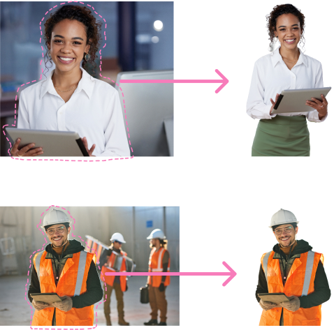
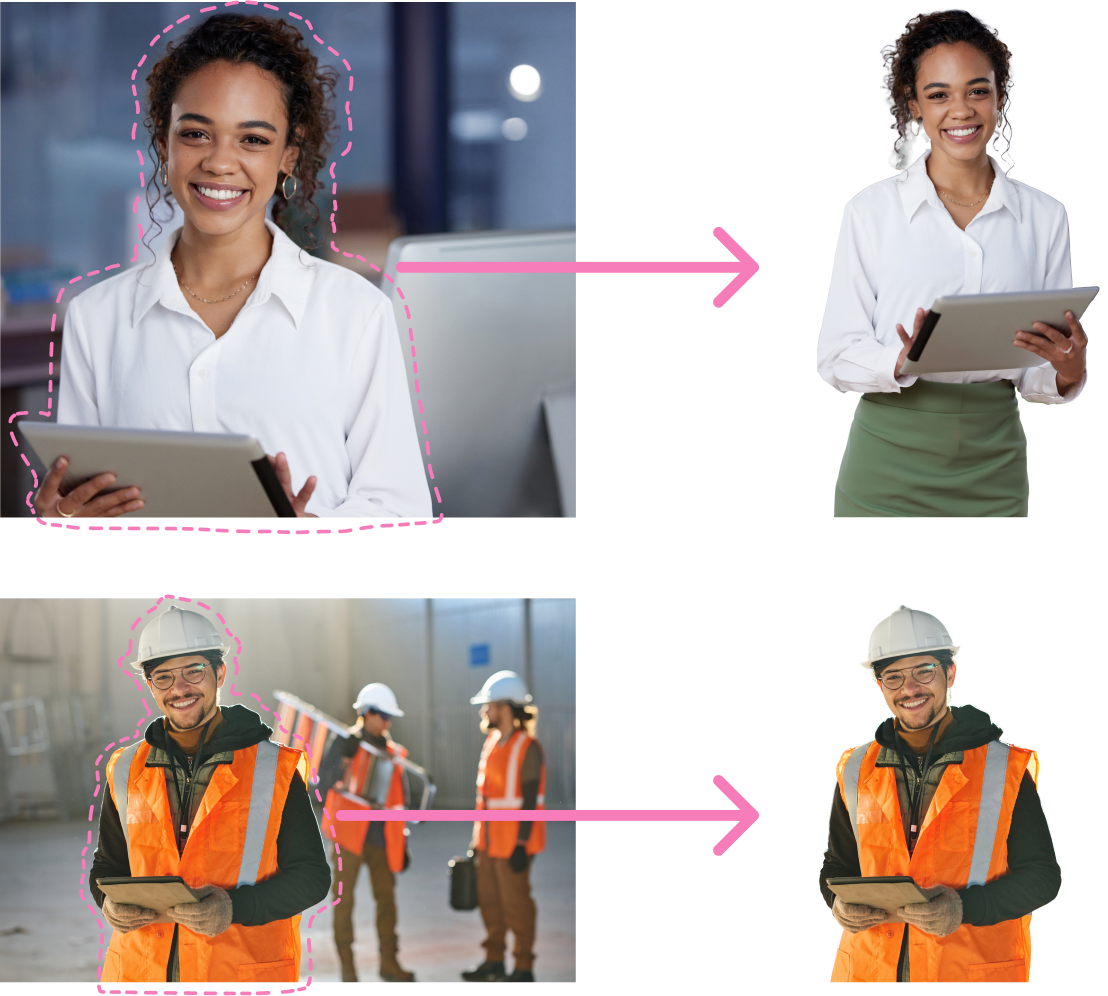
As I had a limit with stock pictures I could use, I first started by looking for female and male models that were inserted into a work environment with a happy and friendly look. I specifically looked for pictures where the model was positioned mostly in the corner of the image, so I could use the white space for adding my designs.
Using Adobe Photoshop, I managed to crop out the main figure from the background so it could give me flexibility to create and rearrange elements on my composition to better convey the message, for example:
After getting approval on the some images, the marketing team shared with me a few text options so I could work with more than one text while creating the visual layout.
Visual composition
For this step, I usually play around with basic shapes to quickly display my ideas, discarding what doesn’t work, finding the focus point, better placing of the text and playing around with colours.
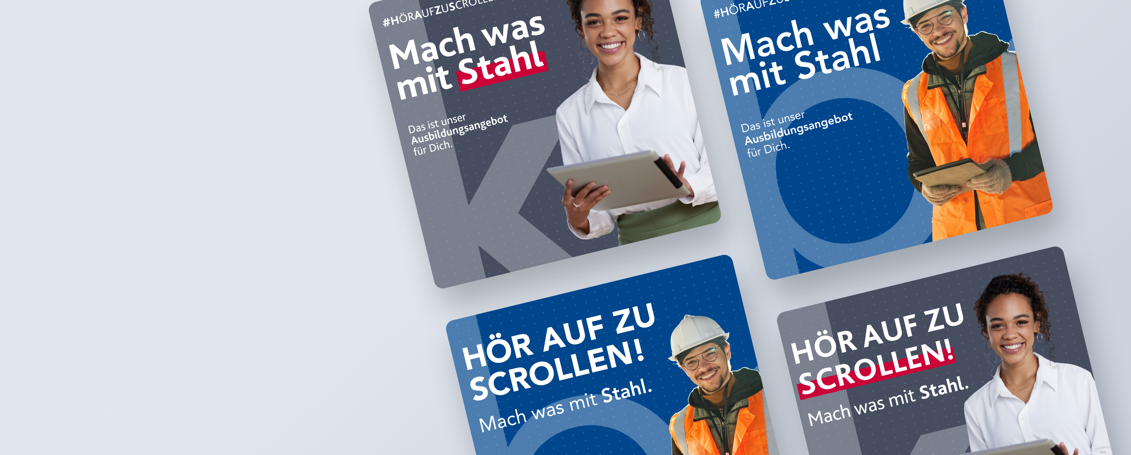
Each draft had a different arrangement and layout. The floating grey box for text have a more visual appealing proposal, where the image background and model were the main focus of the post. For the big grey background, the text has the stage, where the models are merely illustrative. This are the drafts and some variants for the first proposal:
This first proposal was what Kloeckner Metals had envisioned, so I delivered this one and another different approach more, so Kloeckner could have plenty of options to choose from or even test them out.
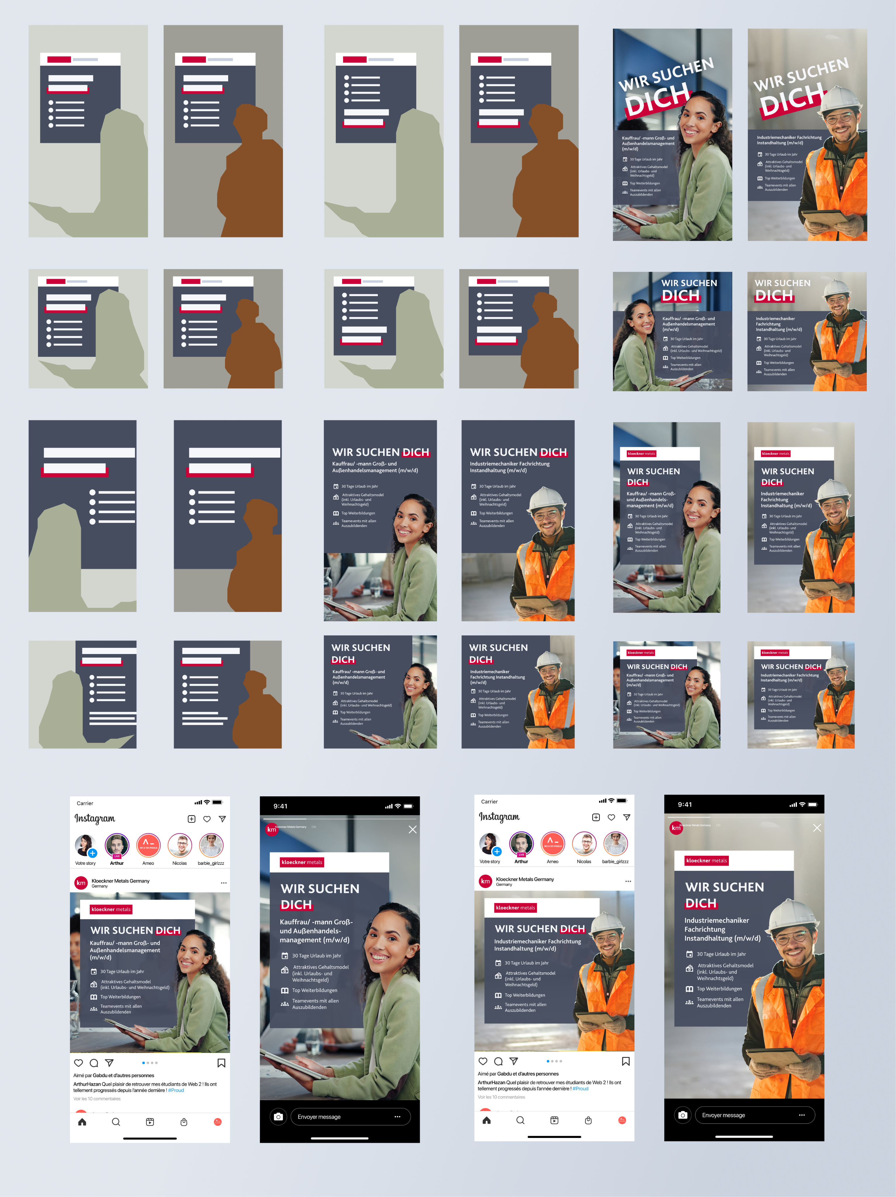
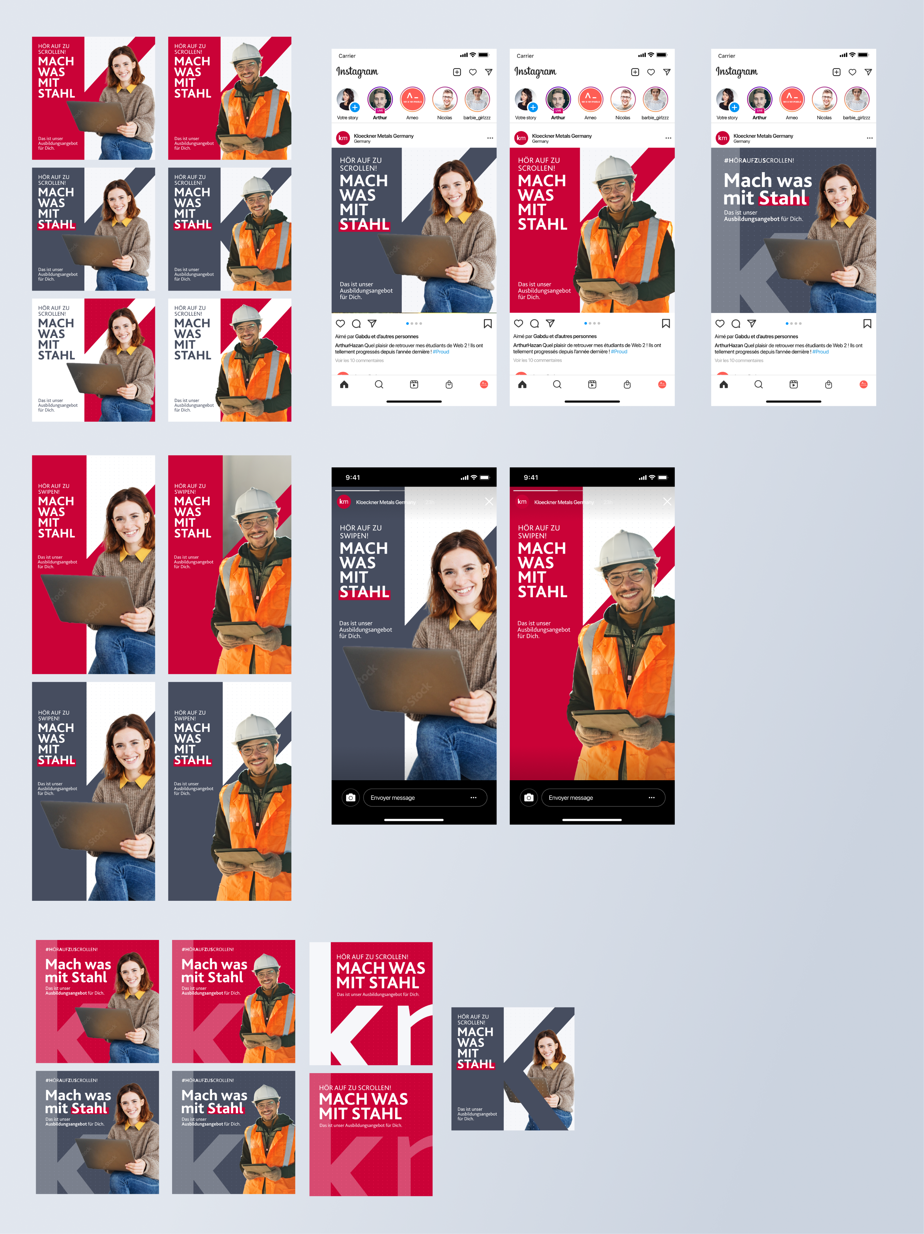
The second approach was to be a little bit bold with the colors and layout. The idea was to catch the target public’s attention while scrolling on Instagram, which is not an easy task. Because of that, I used the famous Kloeckner’s red and made it my main colour. Instead of basic shapes for text, I took the “K” from Kloeckner’s logo and used as a dynamic background, where I had plenty of space to position my text.
With those new and fresh colour and element, I had a lot of ideas for layout and composition, so I created a few variables:
Final designs
Once I presented the proposals, Kloeckner Metals Germany liked version 01 and version 03, so they decided to create a test for both designs, so we could find out which one would better perform once published on Instagram:
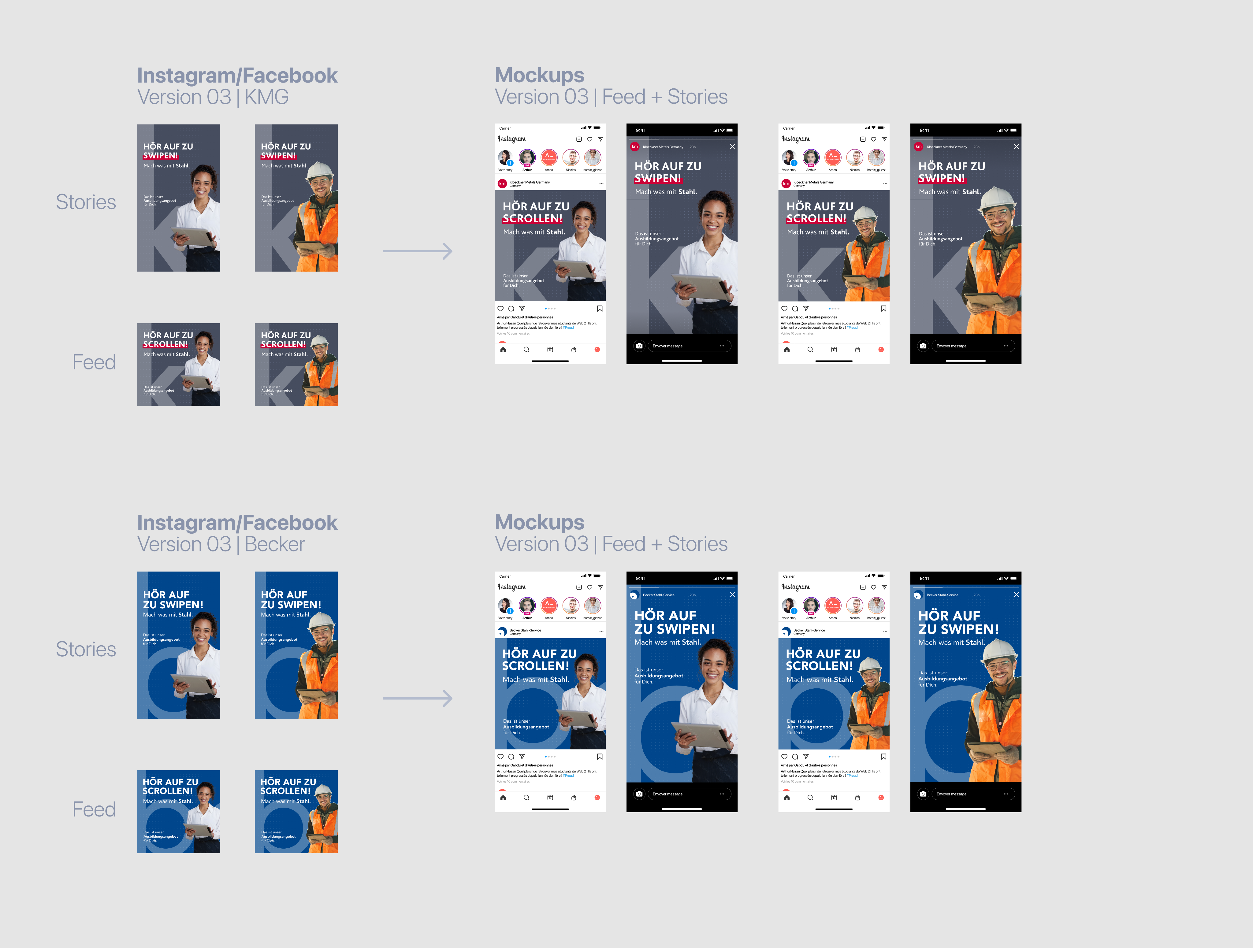
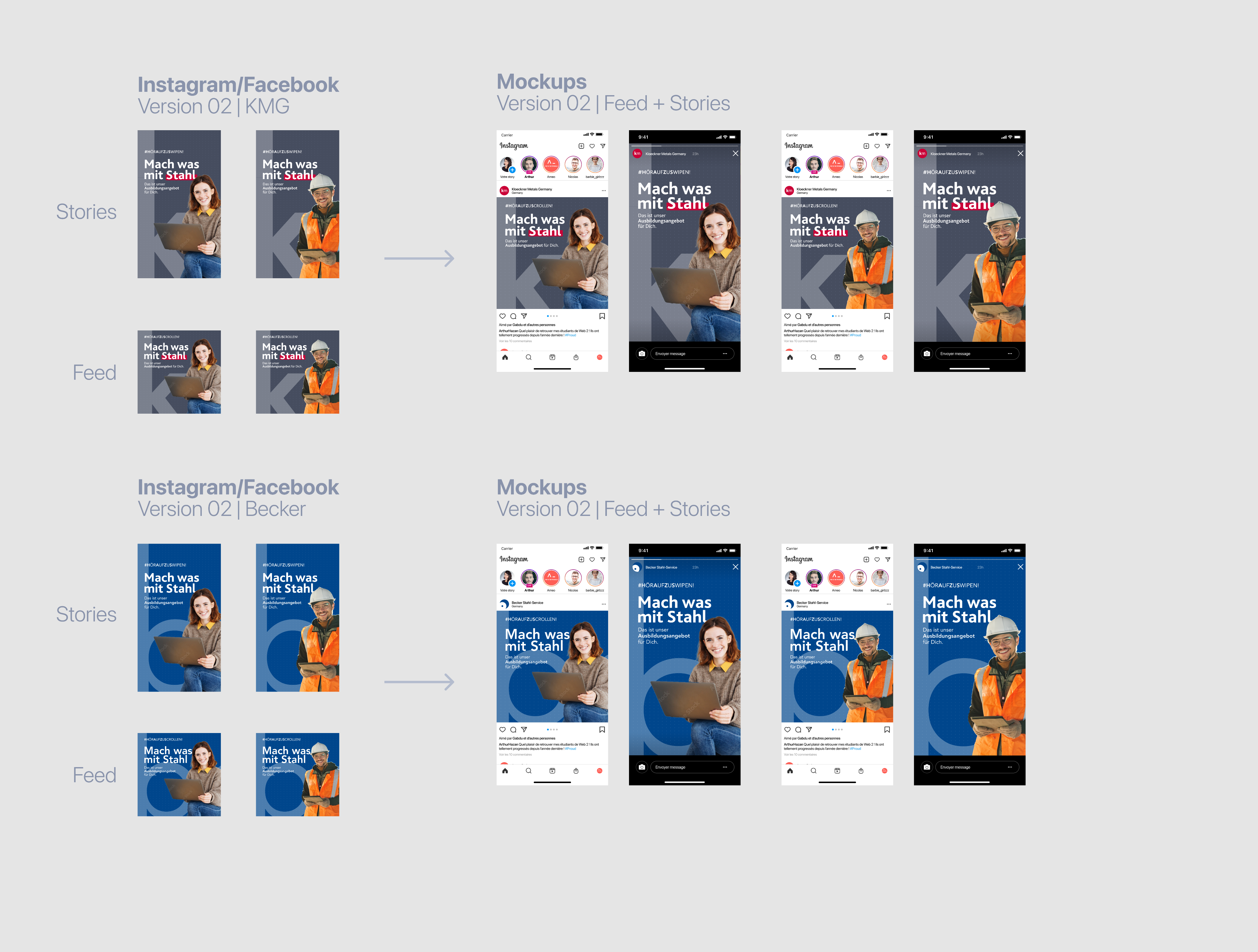
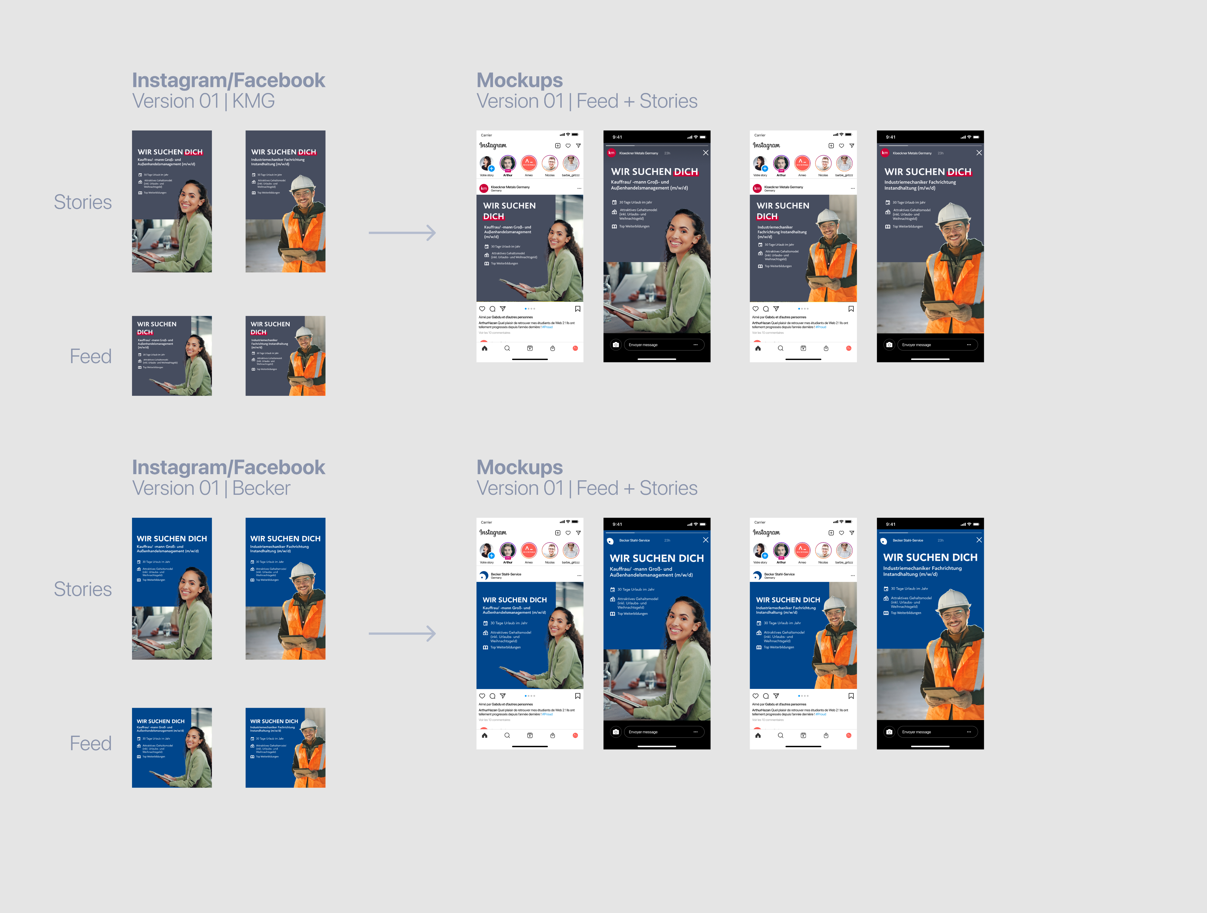
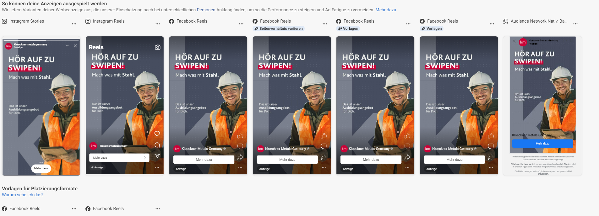
I handed versions 01 and 03 to the marketing team and they set up the test that would be running on Instagram through Meta. We checked how the designs would behave on Instagram sponsoring, making sure no text were blocked by any Instagram ads’ UI:
Results
The metric of success was to fill the 13 intern vacancies for both office and warehouse jobs. After three weeks of testing, the marketing team came up with these datas:

Version 02 were the winner
While version 01 had 32% of the clicks, the version 02 were undoubtably the winner, having click rates by 68%
Vacancies filled
Ten out of thirteen hired candidates reported that they find out about the job via Instagram.
Did you like
this project?
Contact me!
I'd love to hear about your vision and explore how we can work together.
Let’s have a chat and find out if we’re a match!


Check out other projects
Made with lots of ☕ and 💖 • © 2025 Rebeca Natalie


Home > Visuals for Recruitment Campaign
Visuals for Recruitment Campaign
Creation of a series of Instagram posts & stories for an internship recruitment campaign at Kloeckner Metals Germany.
Skills and tools used in this project:
Visual Composition
Photo Editing
Brand Consistency
Figma
Adobe Photoshop
Challenge
Kloeckner Metals Germany had opened up vacancies for interns and they wanted to promote those opportunities on Social Media. Fortunately, the pay and benefits were very attractive, so trying to get young people to apply was a pleasant work. So we gather the following information for this campaign:
Brand presence
Although we are addressing to a younger generation, I had to create a series of visuals that could be catchy and interesting, without hurting the Kloeckner Visual Identity, which consist mainly on a grey scale and bright red.
Social Media Platform
As pointed out on the Statista* from a 2024 research, the most used social media by our public target was Instagram - so all our campaign had to be prepared for Instagram.
*Click here to check out the Statista research
Public Target: 18 - 20 years old
The focus was on freshly out of College young people, who seek their first job experience.
Exploration phase
As I had a limit with stock pictures I could use, I first started by looking for female and male models that were inserted into a work environment with a happy and friendly look. I specifically looked for pictures where the model was positioned mostly in the corner of the image, so I could use the white space for adding my designs.
Using Adobe Photoshop, I managed to crop out the main figure from the background so it could give me flexibility to create and rearrange elements on my composition to better convey the message, for example:
After getting approval on the some images, the marketing team shared with me a few text options so I could work with more than one text while creating the visual layout.
Visual composition
For this step, I usually play around with basic shapes to quickly display my ideas, discarding what doesn’t work, finding the focus point, better placing of the text and playing around with colours.
Each draft had a different arrangement and layout. The floating grey box for text have a more visual appealing proposal, where the image background and model were the main focus of the post. For the big grey background, the text has the stage, where the models are merely illustrative. This are the drafts and some variants for the first proposal:
This first proposal was what Kloeckner Metals had envisioned, so I delivered this one and another different approach more, so Kloeckner could have plenty of options to choose from or even test them out.
The second approach was to be a little bit bold with the colors and layout. The idea was to catch the target public’s attention while scrolling on Instagram, which is not an easy task. Because of that, I used the famous Kloeckner’s red and made it my main colour. Instead of basic shapes for text, I took the “K” from Kloeckner’s logo and used as a dynamic background, where I had plenty of space to position my text.
With those new and fresh colour and element, I had a lot of ideas for layout and composition, so I created a few variables:
Final designs
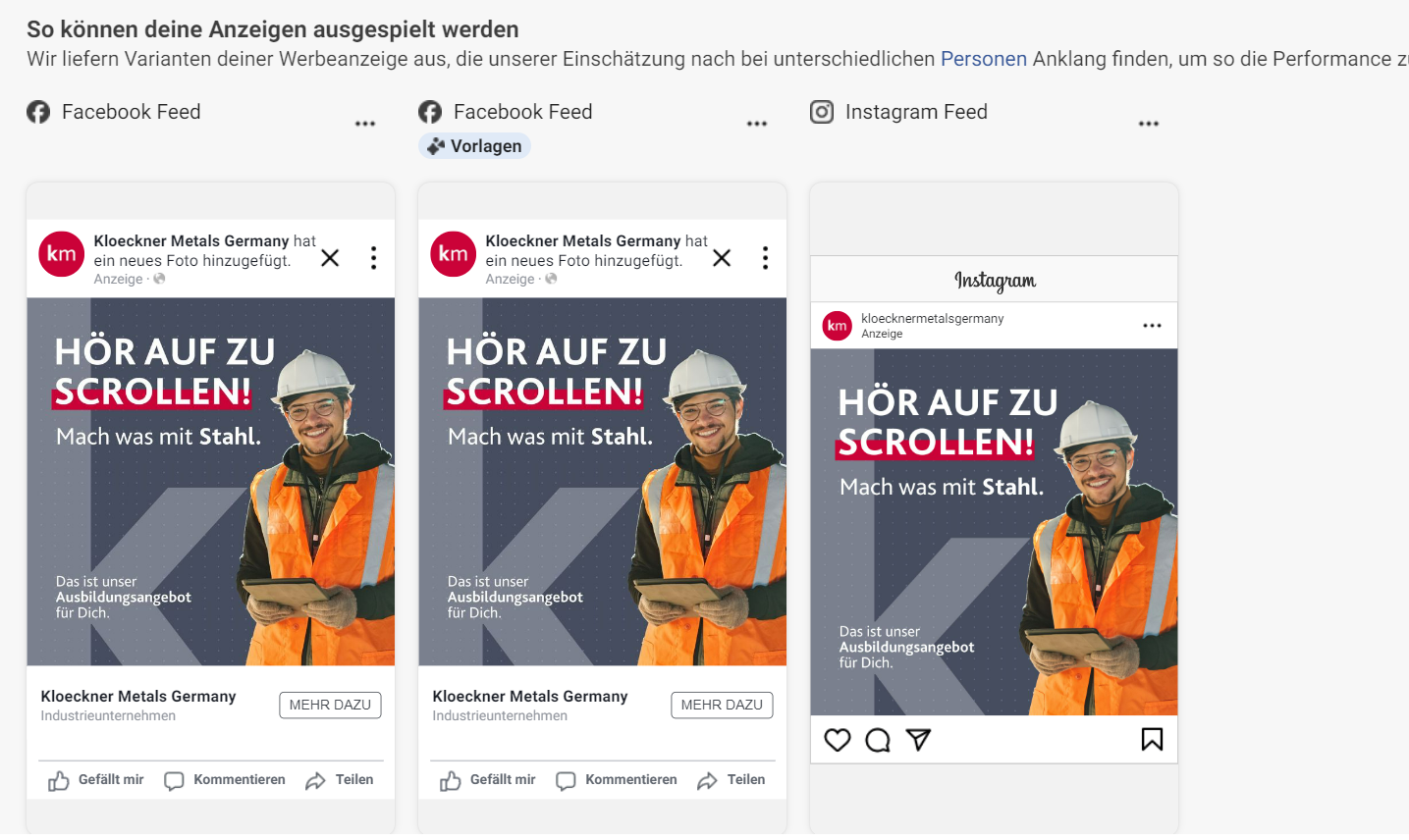
Once I presented the proposals, Kloeckner Metals Germany liked version 01 and version 03, so they decided to create a test for both designs, so we could find out which one would better perform once published on Instagram:
I handed versions 01 and 03 to the marketing team and they set up the test that would be running on Instagram through Meta. We checked how the designs would behave on Instagram sponsoring, making sure no text were blocked by any Instagram ads’ UI:
Results
The metric of success was to fill the 13 intern vacancies for both office and warehouse jobs. After three weeks of testing, the marketing team came up with these datas:
Version 02 were the winner
While version 01 had 32% of the clicks, the version 02 were undoubtably the winner, having click rates by 68%
Vacancies filled
Ten out of thirteen hired candidates reported that they find out about the job via Instagram.
Did you like this project? Contact me!
I'd love to hear about your vision and explore how we can work together.
Let’s have a chat and find out if we’re a match!
Check out other projects
Made with lots of ☕ and 💖 • © 2025 Rebeca Natalie

Home > Visuals for Recruitment Campaign
Visuals for Recruitment Campaign
Creation of a series of Instagram posts & stories for an internship recruitment campaign at Kloeckner Metals Germany.
Skills and tools used in this project:
Visual Composition
Photo Editing
Brand Consistency
Figma
Adobe Photoshop
Challenge
Kloeckner Metals Germany had opened up vacancies for interns and they wanted to promote those opportunities on Social Media. Fortunately, the pay and benefits were very attractive, so trying to get young people to apply was a pleasant work. So we gather the following information for this campaign:
Public Target: 18 - 20 years old
The focus was on freshly out of College young people, who seek their first job experience.
Brand presence
Although we are addressing to a younger generation, I had to create a series of visuals that could be catchy and interesting, without hurting the Kloeckner Visual Identity, which consist mainly on a grey scale and bright red.
Social Media Platform
As pointed out on the Statista* from a 2024 research, the most used social media by our public target was Instagram - so all our campaign had to be prepared for Instagram.
*Click here to check out the Statista research
Exploration phase
As I had a limit with stock pictures I could use, I first started by looking for female and male models that were inserted into a work environment with a happy and friendly look. I specifically looked for pictures where the model was positioned mostly in the corner of the image, so I could use the white space for adding my designs.
Using Adobe Photoshop, I managed to crop out the main figure from the background so it could give me flexibility to create and rearrange elements on my composition to better convey the message, for example:
After getting approval on the some images, the marketing team shared with me a few text options so I could work with more than one text while creating the visual layout.
Visual composition
For this step, I usually play around with basic shapes to quickly display my ideas, discarding what doesn’t work, finding the focus point, better placing of the text and playing around with colours.
Each draft had a different arrangement and layout. The floating grey box for text have a more visual appealing proposal, where the image background and model were the main focus of the post. For the big grey background, the text has the stage, where the models are merely illustrative. This are the drafts and some variants for the first proposal:
This first proposal was what Kloeckner Metals had envisioned, so I delivered this one and another different approach more, so Kloeckner could have plenty of options to choose from or even test them out.
The second approach was to be a little bit bold with the colors and layout. The idea was to catch the target public’s attention while scrolling on Instagram, which is not an easy task. Because of that, I used the famous Kloeckner’s red and made it my main colour. Instead of basic shapes for text, I took the “K” from Kloeckner’s logo and used as a dynamic background, where I had plenty of space to position my text.
With those new and fresh colour and element, I had a lot of ideas for layout and composition, so I created a few variables:
Final designs
Once I presented the proposals, Kloeckner Metals Germany liked version 01 and version 03, so they decided to create a test for both designs, so we could find out which one would better perform once published on Instagram:
I handed versions 01 and 03 to the marketing team and they set up the test that would be running on Instagram through Meta. We checked how the designs would behave on Instagram sponsoring, making sure no text were blocked by any Instagram ads’ UI:
Results
The metric of success was to fill the 13 intern vacancies for both office and warehouse jobs. After three weeks of testing, the marketing team came up with these datas:
Version 02 were the winner
While version 01 had 32% of the clicks, the version 02 were undoubtably the winner, having click rates by 68%
Vacancies filled
Ten out of thirteen hired candidates reported that they find out about the job via Instagram.
Did you like this project? Contact me!
I'd love to hear about your vision and explore how we can work together.
Let’s have a chat and find out if we’re a match!
Check out other projects
Made with lots of ☕ and 💖 • © 2025 Rebeca Natalie
