Home > Content Landing Page Interface
Content Landing Page Interface
Creation of a series of Landing Pages featuring online and offline services that Kloeckner Metals Germany offers to its B2B clients through the Online-Shop.
Skills and tools used in this project:
User Interviews
Visual Hierarchy
Brand Consistency
Design System
Wireframing
Figma
Adobe Photoshop
Adobe Illustrator
Problems
After some interviews with internal clients and employees, it was found out that very often users were confused and overwhelmed by complex, messy and highly technical information to help them decide on which service they would like to get or even know that Kloeckner Metals offered that kind of service. It was identified by the Kloeckner Metals Germany group what were the major four pain points:

Scattered information
Kloeckner used to place all the needed information scattered around different websites (blog/corporate website/online shop) and in different formats (content on page, downloadable pdf, e-mails marketing), making it difficult for the user to find relevant information for their inquiry
No awareness of services provided
Kloeckner Metals have great services of customisation of their materials before the delivery, but almost none of the B2B clients were aware of this service. This could be costing Kloeckner their customers under the false perception that Kloeckner was just a commodity company, rather than a complete service of product selling, customisation of those materials and delivery
Highly technical content
The majority complained about having to get through long and boring content and tables to find what they needed
Challenge
Kloeckner Metals Germany’s request was to gather and transform all relevant information to help the users to make a more informed decision while shopping at the e-commerce, as well pushing the services to increase awareness.
So our challenge were how to improve the discoverability and readability of that content for our users. With the support of Marketing and Sales team, we delegated tasks and defined steps to get the job done.
Our goal was to increase awareness and click rate on promotional banners and newsletters, as well as the traffic on the pages that had the service’s content.
Exploration phase
The Marketing and Sales team gathered all relevant information, filtering and rewriting all the complex content into a more simple and practical way.
Having all reviewed content in hands, I could move on and create a series of wireframes, exploring layout compositions and possibilities considering the current CMS we had. In total, we had to offer 12 services (some offered online, others being requested by phone exclusively). Our solution was to promote the 4 online services, as the company major goal at the moment was promoting the Online Shop and help clients transition to digital, and then offer the offline services.
It was essential having a landing page were we offered 12 services in a attractive and simple way, inviting the user to click on the service they have interest or need to read more.
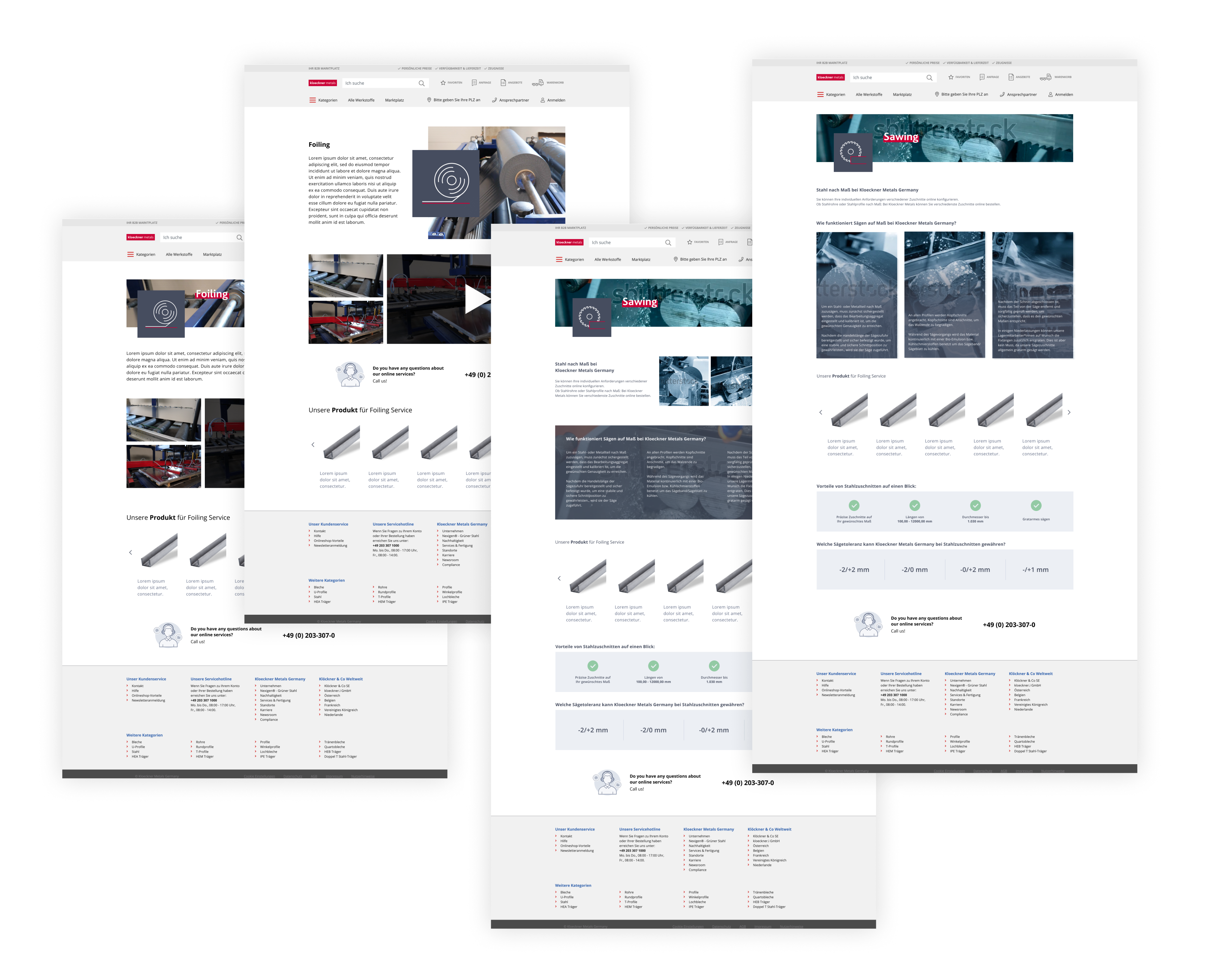
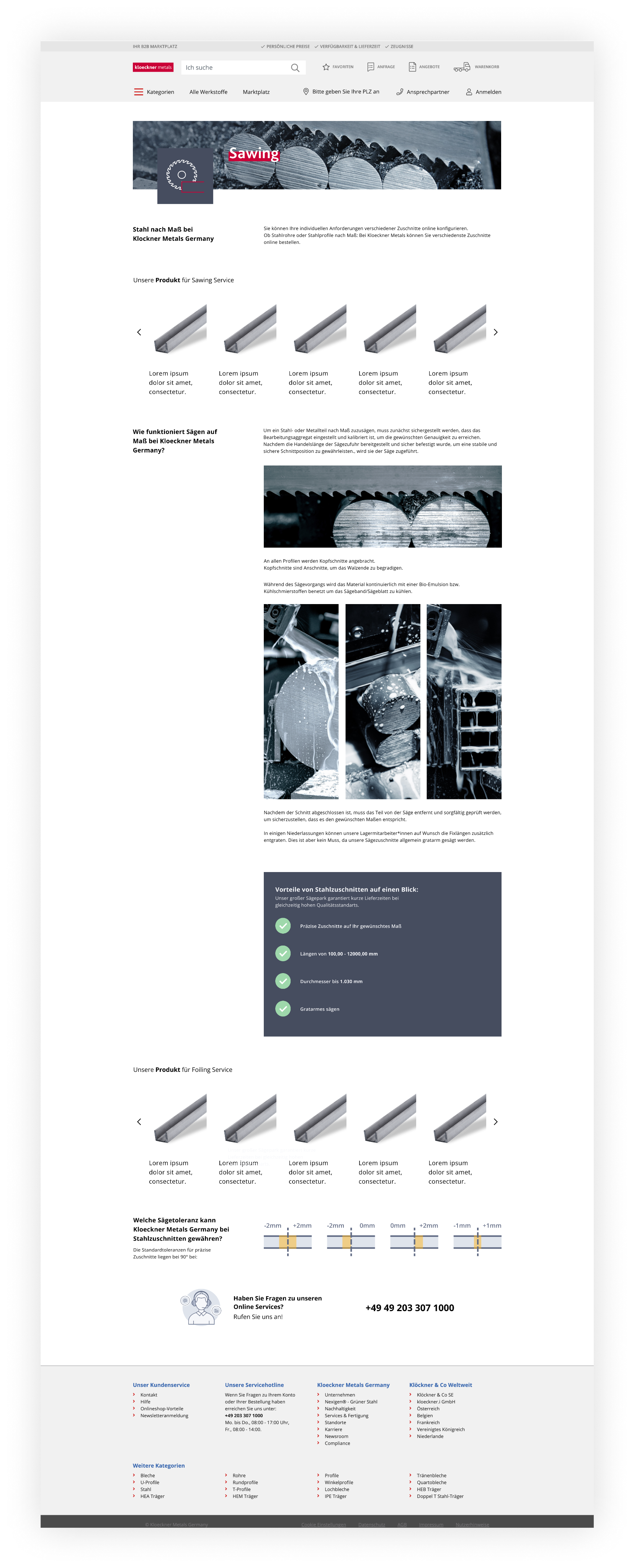
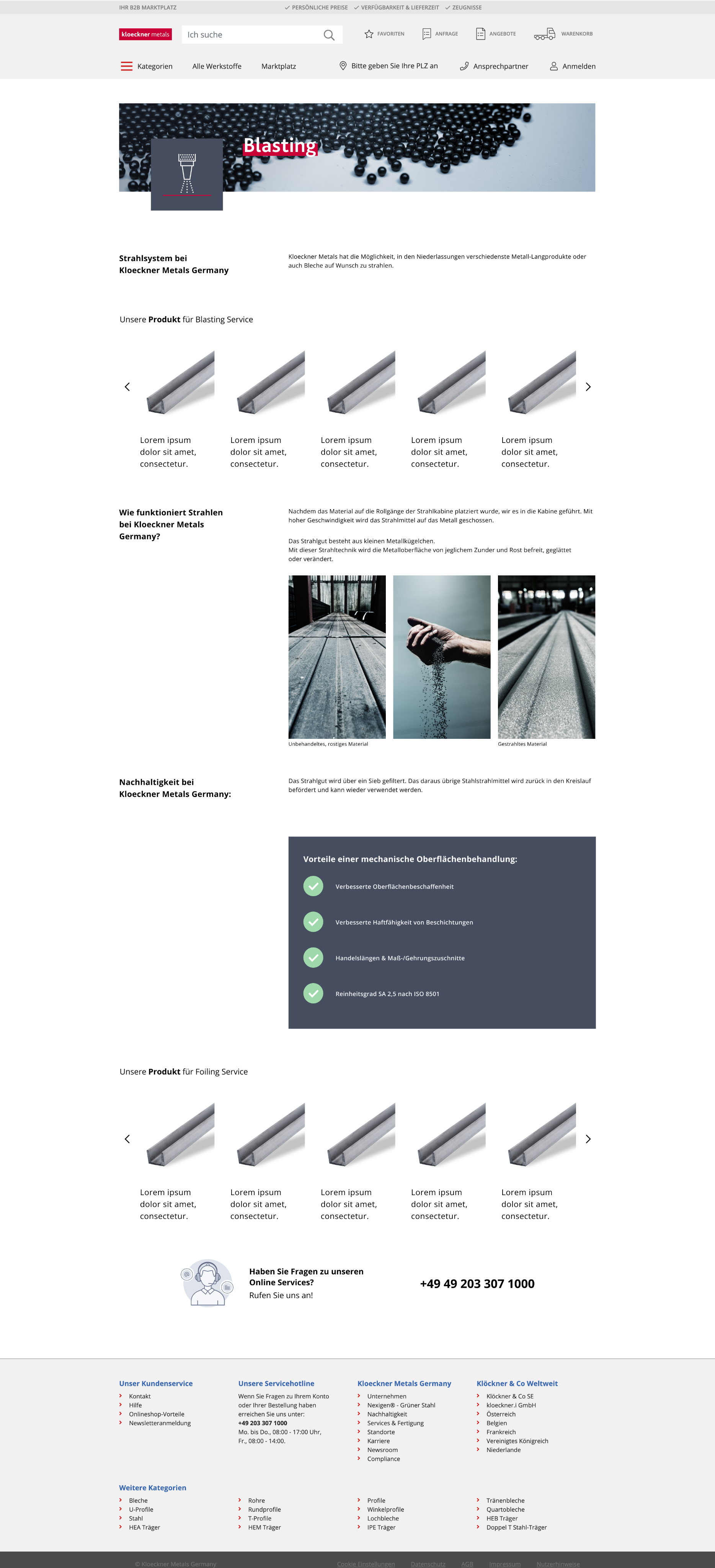
I focused primarily on designing the content landing pages for each services provided, for SEO purposes (usually the page users find first while conducting an online search regarding an specific service). The design goal here was to achieve an interesting but practical visual design, where the user could easily navigate and get only the essential information they need to make a decision.
So I divided four to six sections and structure by:
HEADER
Name + Quick description
Clear visual of service
PRODUCT RECOMMENDATION
Recommendation of Products for sale
available for that service
MIDDLE SECTION/GALLERY
Clear visual of service +
finalised product pictures
USPs
Highlight of the reasons
for getting this service
CUT TOLERANCE (IF NEEDED)
A visual guide to show the
different cut tolerance of the service
CONTACT + FOOTER
Reassure user by providing
contact information
After gathering some feedbacks with my design team, it was pointed out that although the page should be appealing and interesting to the user, the content should be easy and clear to be read. If I could save space at the header and deliver the user directly to the relevant content, I could improve the quality and time of the reader. Also dismissing any overlapping text and image to improve readability, I managed to come up with a good solution.
Final design
You can see below the final designs for each page of the online services + a main landing page that displays all services that Kloeckner Metals Germany offers and all design decisions I made.
2
3
4
6
7
5
1
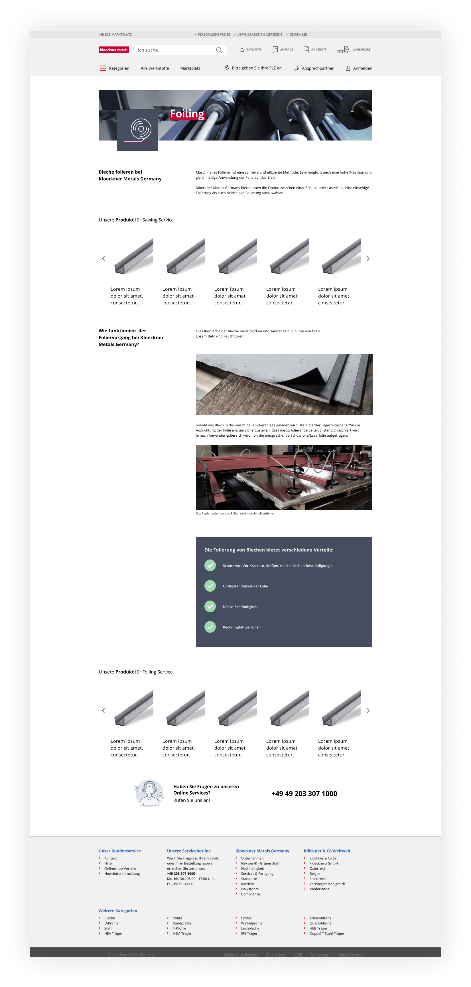
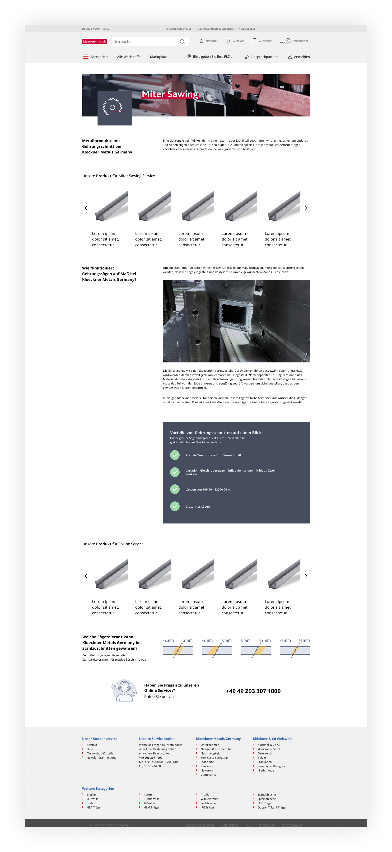
1
I created a series of icons representing each service Kloeckner Metals provides, so it could be easly associated to a processing type. It would be used on promotional banners and, as you can see, at the landing page itself.
2
The layout was divided by two vertical columns, being the first one narrower (that contains titles and subtitles) than the second (that has all the content), so I could easily make the content’s text box shorter and improving readability without exhausting the user.
3
The content was intentionally place in between pictures so the user could have some breathing spaces between text. The visuals were important so it could demonstrate the quality of the work provided.
4
If a anxious client/user doesn’t want to read all of the content, it was important to summarise and highlight the advantages when hiring that service, so the client knows what to expect once they get the finalised product.
5
A second row of recommended products after the content to incentive again the user to click a product that, because of the algorithm, it’s on the user’s interest.
6
Before our intervention, this content was a huge, technical and complex table that would display non relevant information - I managed to translate it into a visual guide where the user can easily understand the cut tolerances they can pick from once they add a product in the cart and checks this service’s option.
7
For the purpose of giving the user peace of mind and a way to contact Kloeckner about any of the services online, a contact information is given at the end of the page so they’re able to contact a sales representative.
1
2
3
4
5
6
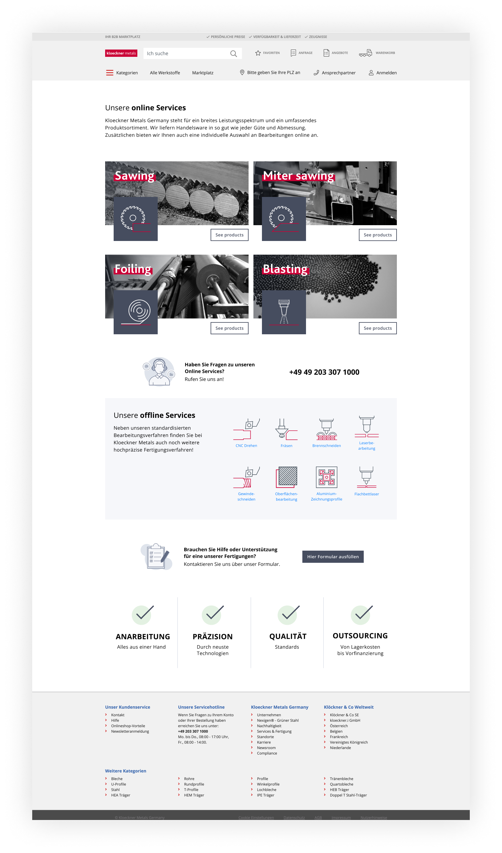
1
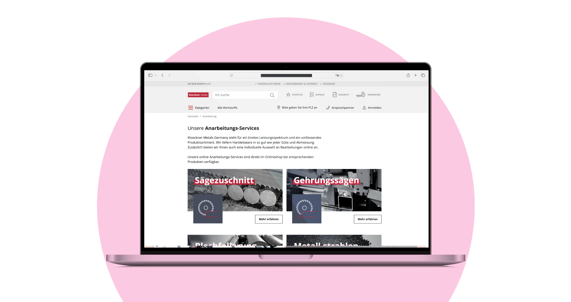
Quick introduction of what are the processing services Kloeckner Metals Germany offers to their clients.
2
The online services were the focus of this whole project, so the grid had a bigger and more sophisticated display. As we couldn’t find high quality image for all processing types, I had to rely on what I had - so I way I found to make all four pictures to feel like part of the same gallery was to make all of them black and white and then add a hover animation where the colours of each service is lighted up. That way I could create visual consistency in the page.
3
Contact information for the online services, as it’s different from the contact about the offline services.
4
The second major section of the main Landing Page is the offline service part. As they are not part of the promotion of services at the e-commerce, we decided on a simpler approach (also a good solution as they have eight offline services) with a short explanation of those.
5
Contact information for the offline services, as it’s different from the contact about the online services.
6
Main USPs for all services Kloeckner Metals provides, before the user jumps right in on one of the processing types’ landing page.
Check it out live


Marketing campaign
To make sure we achieve the metrics of success, the marketing and product team monitored the user behaviour around the banners we uploaded to the homepage of the e-commerce for three months. I produced three banners for the previous design of the website and five visuals for the redesign of the website (at the time the product team was conducting an A/B test on the design, so we had to be prepared for both designs).
Below you can find the explanation of each design decision on the banner disposition and the results:
1
2
3
1
Main component featuring the services Kloeckner provides + CTA to redirect the user to the Landing Pages
Increased clicks in 12%
2
Side component quickly showing icons representing the many services provided + the most searched services in highlight + CTA to the main Landing Page
Increased clicks in 3%
3
High demand service featured in the second component + CTA to the dedicated Landing Page
Increased clicks in 35%
4
5
4
Main component displaying numerous services Kloeckner provides + CTA to the main Landing Page
Increased clicks in 35%
5
Most clicked service
Most clicked service in 16% (in comparison of the other services in the grid)
In a nutshell
All in all, this project was a success! After three months, it was gathered enough information to determine that the Landing Pages were a business success and the next phase were to add these pages into other countries’ e-commerce inside Klockner Metals.

Decreased complains
There was a decreased of 9% of the miscommunications regarding the customisation of products
Increased demand
The report by the Sales Team for the following 3 months showed that there was a significant increase on the demand of the services this project pushed by almost 70%
Increase on traffic
During 3 months of monitoring the e-commerce, it was noticed that there was an increase by 7% of traffic*
*The tracking of only users that clicked on any redirection banner to the services’ landing pages
Positive qualitative
feedback
Internal clients were satisfied with the project, resulting in the creation of more services’ landing pages and the translation of the content in 3 more languages
Did you like
this project?
Contact me!
I'd love to hear about your vision and explore how we can work together.
Let’s have a chat and find out if we’re a match!


Check out other projects
Made with lots of ☕ and 💖 • © 2025 Rebeca Natalie
Rebeca Natalie
Projects
About me
Rebeca Natalie
Projects
About me
Home > Content Landing Page Interface
Content Landing Page Interface
Creation of a series of Landing Pages featuring online and offline services that Kloeckner Metals Germany offers to its B2B clients through the Online-Shop.
Skills and tools used in this project:
User Interviews
Visual Hierarchy
Brand Consistency
Design System
Wireframing
Figma
Adobe Photoshop
Adobe Illustrator
Problems
After some interviews with internal clients and employees, it was found out that very often users were confused and overwhelmed by complex, messy and highly technical information to help them decide on which service they would like to get or even know that Kloeckner Metals offered that kind of service. It was identified by the Kloeckner Metals Germany group what were the major four pain points:
Scattered information
Kloeckner used to place all the needed information scattered around different websites (blog/corporate website/online shop) and in different formats (content on page, downloadable pdf, e-mails marketing), making it difficult for the user to find relevant information for their inquiry
No awareness of services provided
Kloeckner Metals have great services of customisation of their materials before the delivery, but almost none of the B2B clients were aware of this service. This could be costing Kloeckner their customers under the false perception that Kloeckner was just a commodity company, rather than a complete service of product selling, customisation of those materials and delivery
Highly technical content
The majority complained about having to get through long and boring content and tables to find what they needed
Challenge
Kloeckner Metals Germany’s request was to gather and transform all relevant information to help the users to make a more informed decision while shopping at the e-commerce, as well pushing the services to increase awareness.
So our challenge were how to improve the discoverability and readability of that content for our users. With the support of Marketing and Sales team, we delegated tasks and defined steps to get the job done.
Our goal was to increase awareness and click rate on promotional banners and newsletters, as well as the traffic on the pages that had the service’s content.
Exploration phase
The Marketing and Sales team gathered all relevant information, filtering and rewriting all the complex content into a more simple and practical way.
Having all reviewed content in hands, I could move on and create a series of wireframes, exploring layout compositions and possibilities considering the current CMS we had. In total, we had to offer 12 services (some offered online, others being requested by phone exclusively). Our solution was to promote the 4 online services, as the company major goal at the moment was promoting the Online Shop and help clients transition to digital, and then offer the offline services.
It was essential having a landing page were we offered 12 services in a attractive and simple way, inviting the user to click on the service they have interest or need to read more.
I focused primarily on designing the content landing pages for each services provided, for SEO purposes (usually the page users find first while conducting an online search regarding an specific service). The design goal here was to achieve an interesting but practical visual design, where the user could easily navigate and get only the essential information they need to make a decision.
So I divided four to six sections and structure by:
HEADER
Name + Quick description
Clear visual of service
PRODUCT RECOMMENDATION
Recommendation of Products for sale
available for that service
MIDDLE SECTION/GALLERY
Clear visual of service +
finalised product pictures
USPs
Highlight of the reasons
for getting this service
CUT TOLERANCE (IF NEEDED)
A visual guide to show the
different cut tolerance of the service
CONTACT + FOOTER
Reassure user by providing
contact information
After gathering some feedbacks with my design team, it was pointed out that although the page should be appealing and interesting to the user, the content should be easy and clear to be read. If I could save space at the header and deliver the user directly to the relevant content, I could improve the quality and time of the reader. Also dismissing any overlapping text and image to improve readability, I managed to come up with a good solution.
Final design
You can see below the final designs for each page of the online services + a main landing page that displays all services that Kloeckner Metals Germany offers and all design decisions I made.
2
3
4
6
7
5
1
1
I created a series of icons representing each service Kloeckner Metals provides, so it could be easly associated to a processing type. It would be used on promotional banners and, as you can see, at the landing page itself.
2
The layout was divided by two vertical columns, being the first one narrower (that contains titles and subtitles) than the second (that has all the content), so I could easily make the content’s text box shorter and improving readability without exhausting the user.
3
The content was intentionally place in between pictures so the user could have some breathing spaces between text. The visuals were important so it could demonstrate the quality of the work provided.
4
If a anxious client/user doesn’t want to read all of the content, it was important to summarise and highlight the advantages when hiring that service, so the client knows what to expect once they get the finalised product.
5
A second row of recommended products after the content to incentive again the user to click a product that, because of the algorithm, it’s on the user’s interest.
6
Before our intervention, this content was a huge, technical and complex table that would display non relevant information - I managed to translate it into a visual guide where the user can easily understand the cut tolerances they can pick from once they add a product in the cart and checks this service’s option.
7
For the purpose of giving the user peace of mind and a way to contact Kloeckner about any of the services online, a contact information is given at the end of the page so they’re able to contact a sales representative.
1
2
3
4
5
6
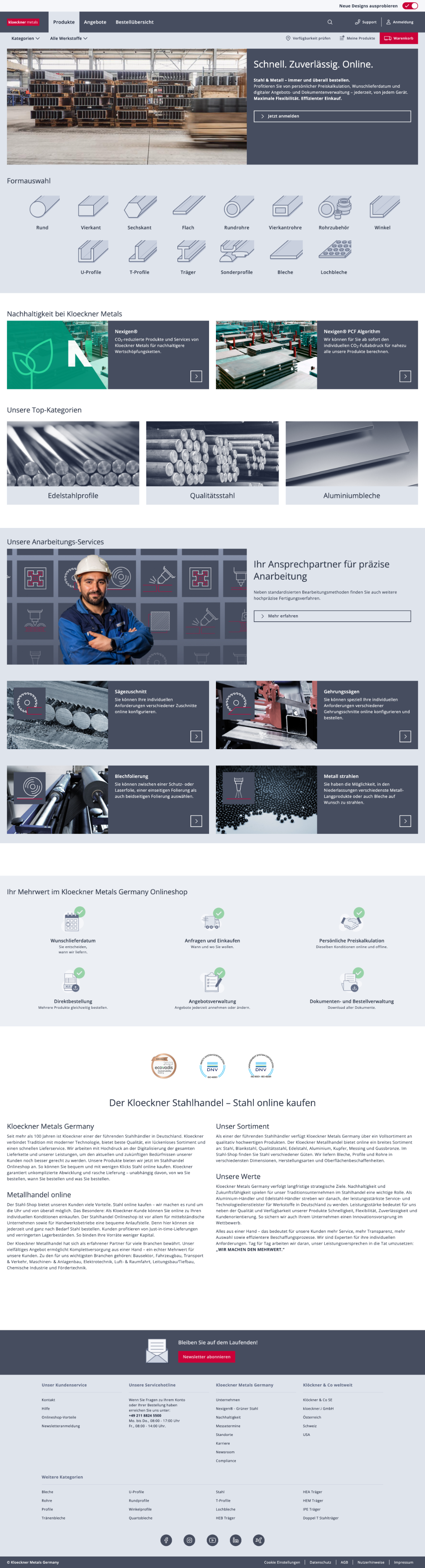
1
Quick introduction of what are the processing services Kloeckner Metals Germany offers to their clients.
2
The online services were the focus of this whole project, so the grid had a bigger and more sophisticated display. As we couldn’t find high quality image for all processing types, I had to rely on what I had - so I way I found to make all four pictures to feel like part of the same gallery was to make all of them black and white and then add a hover animation where the colours of each service is lighted up. That way I could create visual consistency in the page.
3
Contact information for the online services, as it’s different from the contact about the offline services.
4
The second major section of the main Landing Page is the offline service part. As they are not part of the promotion of services at the e-commerce, we decided on a simpler approach (also a good solution as they have eight offline services) with a short explanation of those.
5
Contact information for the offline services, as it’s different from the contact about the online services.
6
Main USPs for all services Kloeckner Metals provides, before the user jumps right in on one of the processing types’ landing page.
Check it out live
Marketing campaign
To make sure we achieve the metrics of success, the marketing and product team monitored the user behaviour around the banners we uploaded to the homepage of the e-commerce for three months. I produced three banners for the previous design of the website and five visuals for the redesign of the website (at the time the product team was conducting an A/B test on the design, so we had to be prepared for both designs).
Below you can find the explanation of each design decision on the banner disposition and the results:
1
2
3
1
Main component featuring the services Kloeckner provides + CTA to redirect the user to the Landing Pages
Increased clicks in 12%
2
Side component quickly showing icons representing the many services provided + the most searched services in highlight + CTA to the main Landing Page
Increased clicks in 3%
3
High demand service featured in the second component + CTA to the dedicated Landing Page
Increased clicks in 35%
4
5
4
Main component displaying numerous services Kloeckner provides + CTA to the main Landing Page
Increased clicks in 35%
5
Most clicked service
Most clicked service in 16% (in comparison of the other services in the grid)
In a nutshell
All in all, this project was a success! After three months, it was gathered enough information to determine that the Landing Pages were a business success and the next phase were to add these pages into other countries’ e-commerce inside Klockner Metals.
Decreased complains
There was a decreased of 9% of the miscommunications regarding the customisation of products
Increased demand
The report by the Sales Team for the following 3 months showed that there was a significant increase on the demand of the services this project pushed by almost 70%
Increase on traffic
During 3 months of monitoring the e-commerce, it was noticed that there was an increase by 7% of traffic*
*The tracking of only users that clicked on any redirection banner to the services’ landing pages
Positive qualitative feedback
Internal clients were satisfied with the project, resulting in the creation of more services’ landing pages and the translation of the content in 3 more languages
Did you like this project? Contact me!
I'd love to hear about your vision and explore how we can work together.
Let’s have a chat and find out if we’re a match!
Check out other projects
Made with lots of ☕ and 💖 • © 2025 Rebeca Natalie
Rebeca Natalie
Projects
About me
Rebeca Natalie
Projects
About me
Home > Content Landing Page Interface
Content Landing Page Interface
Creation of a series of Landing Pages featuring online and offline services that Kloeckner Metals Germany offers to its B2B clients through the Online-Shop.
Skills and tools used in this project:
User Interviews
Visual Hierarchy
Brand Consistency
Design System
Wireframing
Figma
Adobe Photoshop
Adobe Illustrator
Problems
After some interviews with internal clients and employees, it was found out that very often users were confused and overwhelmed by complex, messy and highly technical information to help them decide on which service they would like to get or even know that Kloeckner Metals offered that kind of service. It was identified by the Kloeckner Metals Germany group what were the major four pain points:
Scattered information
Kloeckner used to place all the needed information scattered around different websites (blog/corporate website/online shop) and in different formats (content on page, downloadable pdf, e-mails marketing), making it difficult for the user to find relevant information for their inquiry
No awareness of services provided
Kloeckner Metals have great services of customisation of their materials before the delivery, but almost none of the B2B clients were aware of this service. This could be costing Kloeckner their customers under the false perception that Kloeckner was just a commodity company, rather than a complete service of product selling, customisation of those materials and delivery
Highly technical content
The majority complained about having to get through long and boring content and tables to find what they needed
Challenge
Kloeckner Metals Germany’s request was to gather and transform all relevant information to help the users to make a more informed decision while shopping at the e-commerce, as well pushing the services to increase awareness.
So our challenge were how to improve the discoverability and readability of that content for our users. With the support of Marketing and Sales team, we delegated tasks and defined steps to get the job done.
Our goal was to increase awareness and click rate on promotional banners and newsletters, as well as the traffic on the pages that had the service’s content.
Exploration phase
The Marketing and Sales team gathered all relevant information, filtering and rewriting all the complex content into a more simple and practical way.
Having all reviewed content in hands, I could move on and create a series of wireframes, exploring layout compositions and possibilities considering the current CMS we had. In total, we had to offer 12 services (some offered online, others being requested by phone exclusively). Our solution was to promote the 4 online services, as the company major goal at the moment was promoting the Online Shop and help clients transition to digital, and then offer the offline services.
It was essential having a landing page were we offered 12 services in a attractive and simple way, inviting the user to click on the service they have interest or need to read more.
I focused primarily on designing the content landing pages for each services provided, for SEO purposes (usually the page users find first while conducting an online search regarding an specific service). The design goal here was to achieve an interesting but practical visual design, where the user could easily navigate and get only the essential information they need to make a decision.
So I divided four to six sections and structure by:
HEADER
Name + Quick description
Clear visual of service
PRODUCT RECOMMENDATION
Recommendation of Products for sale
available for that service
MIDDLE SECTION/GALLERY
Clear visual of service +
finalised product pictures
USPs
Highlight of the reasons
for getting this service
CUT TOLERANCE (IF NEEDED)
A visual guide to show the
different cut tolerance of the service
CONTACT + FOOTER
Reassure user by providing
contact information
After gathering some feedbacks with my design team, it was pointed out that although the page should be appealing and interesting to the user, the content should be easy and clear to be read. If I could save space at the header and deliver the user directly to the relevant content, I could improve the quality and time of the reader. Also dismissing any overlapping text and image to improve readability, I managed to come up with a good solution.
Final design
You can see below the final designs for each page of the online services + a main landing page that displays all services that Kloeckner Metals Germany offers and all design decisions I made.
2
3
4
6
7
5
1
1
I created a series of icons representing each service Kloeckner Metals provides, so it could be easly associated to a processing type. It would be used on promotional banners and, as you can see, at the landing page itself.
2
The layout was divided by two vertical columns, being the first one narrower (that contains titles and subtitles) than the second (that has all the content), so I could easily make the content’s text box shorter and improving readability without exhausting the user.
3
The content was intentionally place in between pictures so the user could have some breathing spaces between text. The visuals were important so it could demonstrate the quality of the work provided.
4
If a anxious client/user doesn’t want to read all of the content, it was important to summarise and highlight the advantages when hiring that service, so the client knows what to expect once they get the finalised product.
5
A second row of recommended products after the content to incentive again the user to click a product that, because of the algorithm, it’s on the user’s interest.
6
Before our intervention, this content was a huge, technical and complex table that would display non relevant information - I managed to translate it into a visual guide where the user can easily understand the cut tolerances they can pick from once they add a product in the cart and checks this service’s option.
7
For the purpose of giving the user peace of mind and a way to contact Kloeckner about any of the services online, a contact information is given at the end of the page so they’re able to contact a sales representative.
1
2
3
4
5
6
1
Quick introduction of what are the processing services Kloeckner Metals Germany offers to their clients.
2
The online services were the focus of this whole project, so the grid had a bigger and more sophisticated display. As we couldn’t find high quality image for all processing types, I had to rely on what I had - so I way I found to make all four pictures to feel like part of the same gallery was to make all of them black and white and then add a hover animation where the colours of each service is lighted up. That way I could create visual consistency in the page.
3
Contact information for the online services, as it’s different from the contact about the offline services.
4
The second major section of the main Landing Page is the offline service part. As they are not part of the promotion of services at the e-commerce, we decided on a simpler approach (also a good solution as they have eight offline services) with a short explanation of those.
5
Contact information for the offline services, as it’s different from the contact about the online services.
6
Main USPs for all services Kloeckner Metals provides, before the user jumps right in on one of the processing types’ landing page.
Check it out live
Marketing campaign
To make sure we achieve the metrics of success, the marketing and product team monitored the user behaviour around the banners we uploaded to the homepage of the e-commerce for three months. I produced three banners for the previous design of the website and five visuals for the redesign of the website (at the time the product team was conducting an A/B test on the design, so we had to be prepared for both designs).
Below you can find the explanation of each design decision on the banner disposition and the results:
1
2
3
1
Main component featuring the services Kloeckner provides + CTA to redirect the user to the Landing Pages
Increased clicks in 12%
2
Side component quickly showing icons representing the many services provided + the most searched services in highlight + CTA to the main Landing Page
Increased clicks in 3%
3
High demand service featured in the second component + CTA to the dedicated Landing Page
Increased clicks in 35%
4
5
4
Main component displaying numerous services Kloeckner provides + CTA to the main Landing Page
Increased clicks in 35%
5
Most clicked service
Most clicked service in 16% (in comparison of the other services in the grid)
In a nutshell
All in all, this project was a success! After three months, it was gathered enough information to determine that the Landing Pages were a business success and the next phase were to add these pages into other countries’ e-commerce inside Klockner Metals.
Increased demand
The report by the Sales Team for the following 3 months showed that there was a significant increase on the demand of the services this project pushed by almost 70%
Decreased complains
There was a decreased of 9% of the miscommunications regarding the customisation of products
Increase on traffic
During 3 months of monitoring the e-commerce, it was noticed that there was an increase by 7% of traffic*
*The tracking of only users that clicked on any redirection banner to the services’ landing pages
Positive qualitative feedback
Internal clients were satisfied with the project, resulting in the creation of more services’ landing pages and the translation of the content in 3 more languages
Did you like this project? Contact me!
I'd love to hear about your vision and explore how we can work together.
Let’s have a chat and find out if we’re a match!
Check out other projects
Made with lots of ☕ and 💖 • © 2025 Rebeca Natalie
Rebeca Natalie
Projects
About me
Rebeca Natalie
Projects
About me