Rebeca Natalie,
UX/UI Designer
← Back to the Homepage
How I transformed an entire product, from branding to smooth user experience
Challenge:Virail GmbH is a trip ticket search engine, made for travellers find and book the best option for their trip. Either you're traveling by car, train, bus or plane, Virail will bring you in a plate the best tickets for you to book so you can have a better informed choice.
What's the catch?Users didn't even remember they used Virail's services for their travel plans. They would visit the website, maybe even going through the purchase but they didn't recall using Virail.
How to fix that?Because of that, they hired me (hello there) to figure out how to make Virail relevant and memorable and find out how could they solve real problems for their users.
How to even start?
Never have I ever heard about something like this. How come users didn't remember using their services? So the logic way was to check data.Once I joined, I wanted to understand where the request of redesign was coming. Digging through folders and documentation, I found out an external agency's report on user interviews. From that, I got what I needed to know:
👤 Unmemorable experience
The reports showed that it was necessary to show the Virail's website again for the user, because they didn't recall using it.In terms of digital experience, is like meeting someone and interact with them long enough until it’s too awkward to ask their name again.
ℹ️ Poor prioritization
The content on the most important pages weren't following any specific hierarchy, making users feel overwhelmed and confused, quickly abandoning the website.The rate of permanency at the search engine page was of 4 or less seconds.
😵💫 Overcomplicated user journey
Low rate of users completing the user journey due to too many clicks and steps before completing a purchase.Eye tracking tool (Hotjar) indicated that users were having trouble finding the right CTAs (they were looking everywhere but the button) to complete a purchase.That’s an UX 101 issue, I’ll tell ya.
📱 Poor mobile responsiveness
Most elements and long content on mobile version were broken or pushing most important info to the bottom of the page.
Exploration phase
Now that I had real data from real users, I had a starting point. Focused on the most important landing pages (homepage, results page and thank you page), I started flagging:
- Hot zones;
- Irrelevant information;
- Potential improvements

HERO SECTION
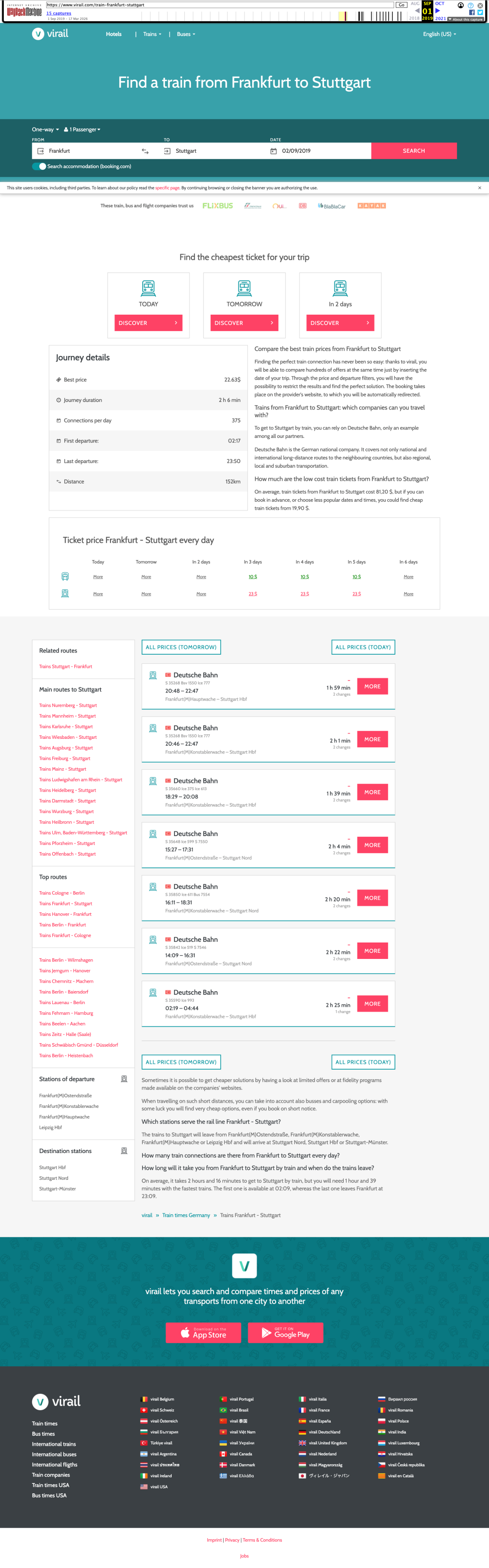
🚩 A big plain header lacking a more interesting element or visual to welcome the user as soon as it lands here - it kept the brand discreet and leading to a boring experience

QUICK INFORMATION
🤔 For SEO purposes, most pages had lots of content regarding the user’s search. It’s a nice to have, but it was misplaced because it’s blocking the real information the user wanted: their trip options
PRICE TABLE
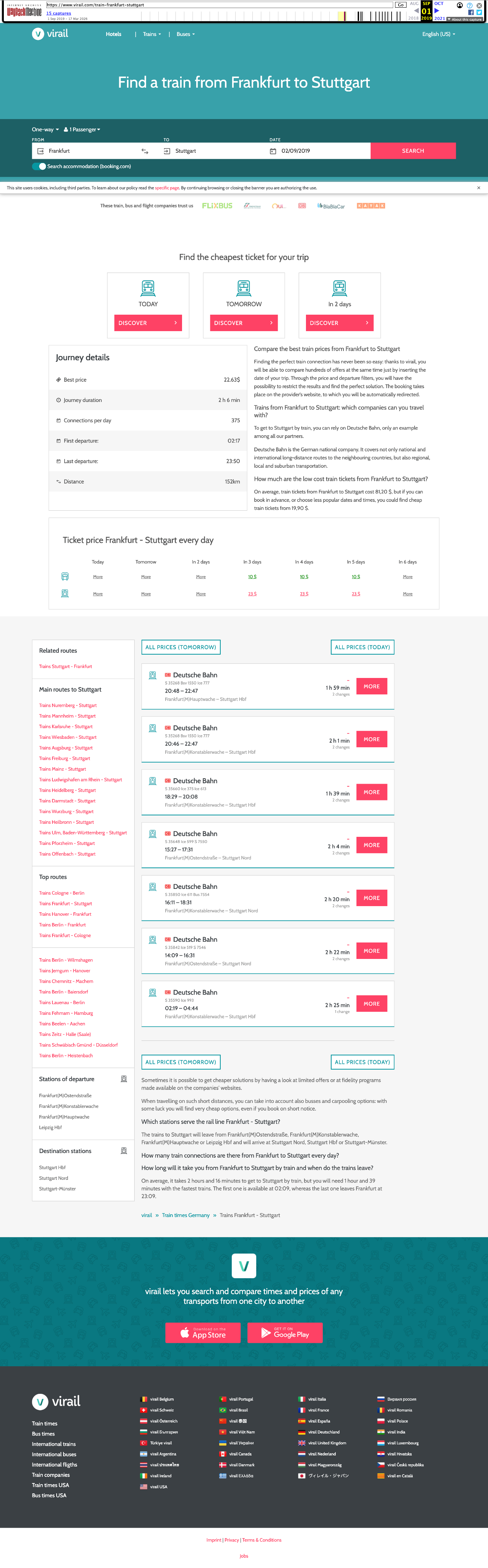
✅ This feature made Virail apart from their competitors. It’s a simple table quickly comparing day prices by locomotion type.This feature should remain and be updated.
USPs
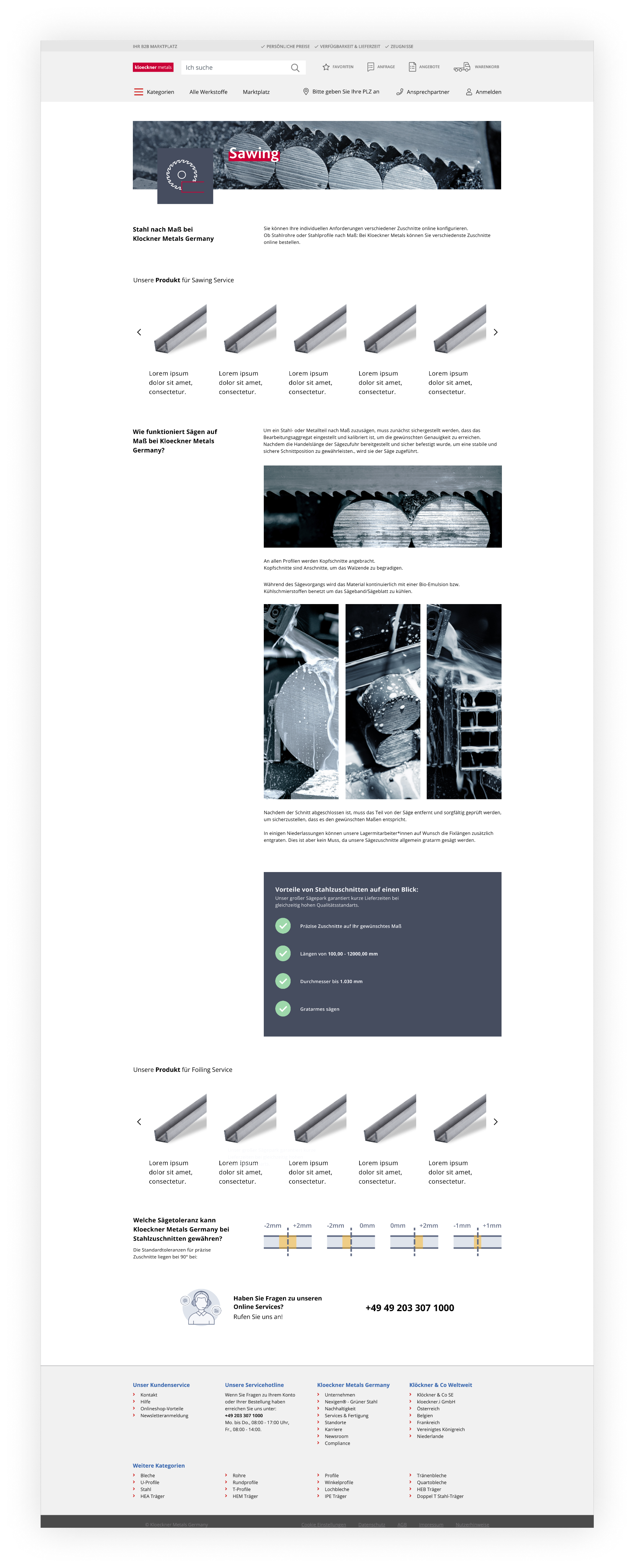
Highlight of what to get from the service processing
CUT TOLERANCE
Visual guide showing the different cut tolerances
CONTACT + FOOTER
Reassure user by providing contact information
UI Styles
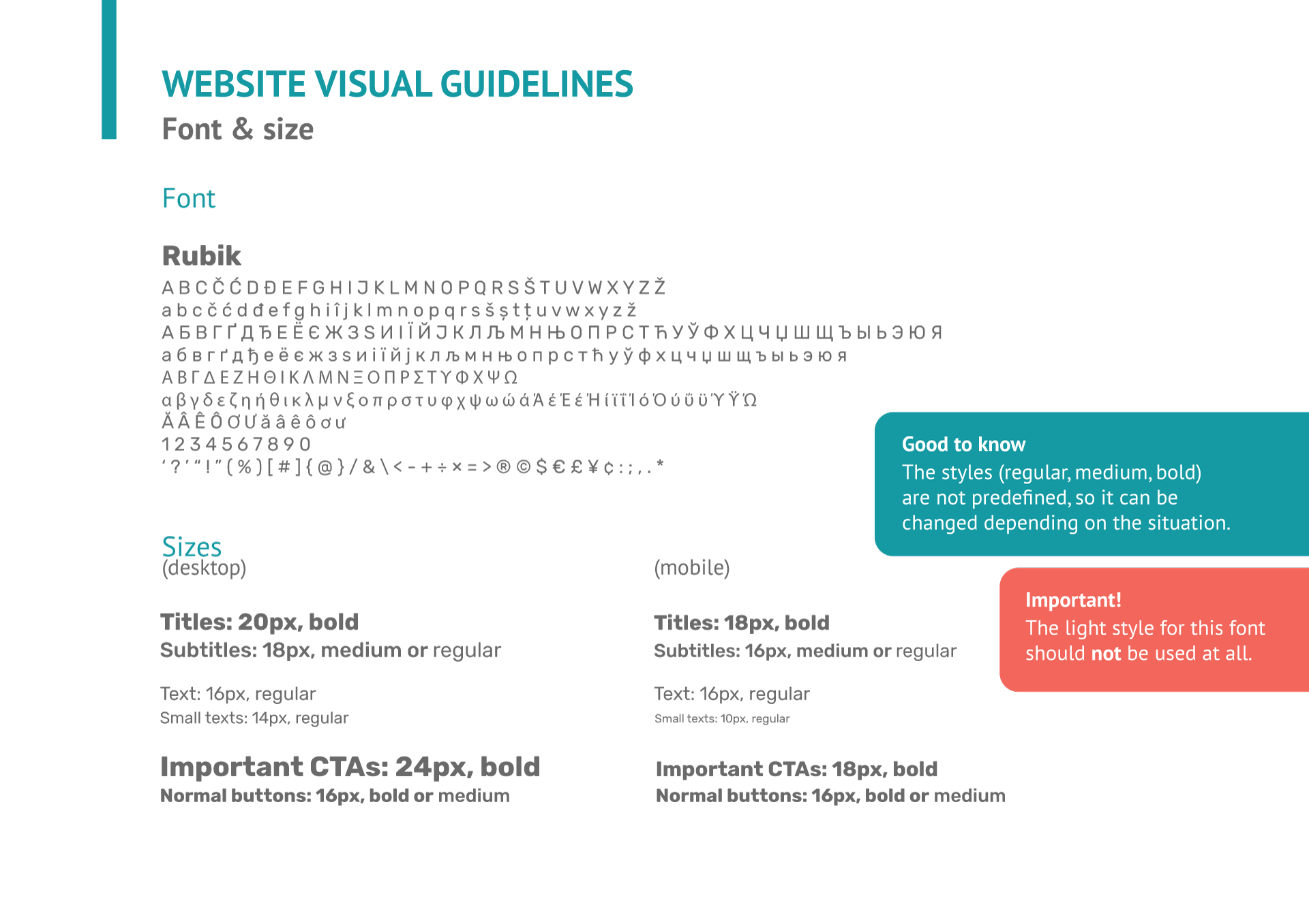
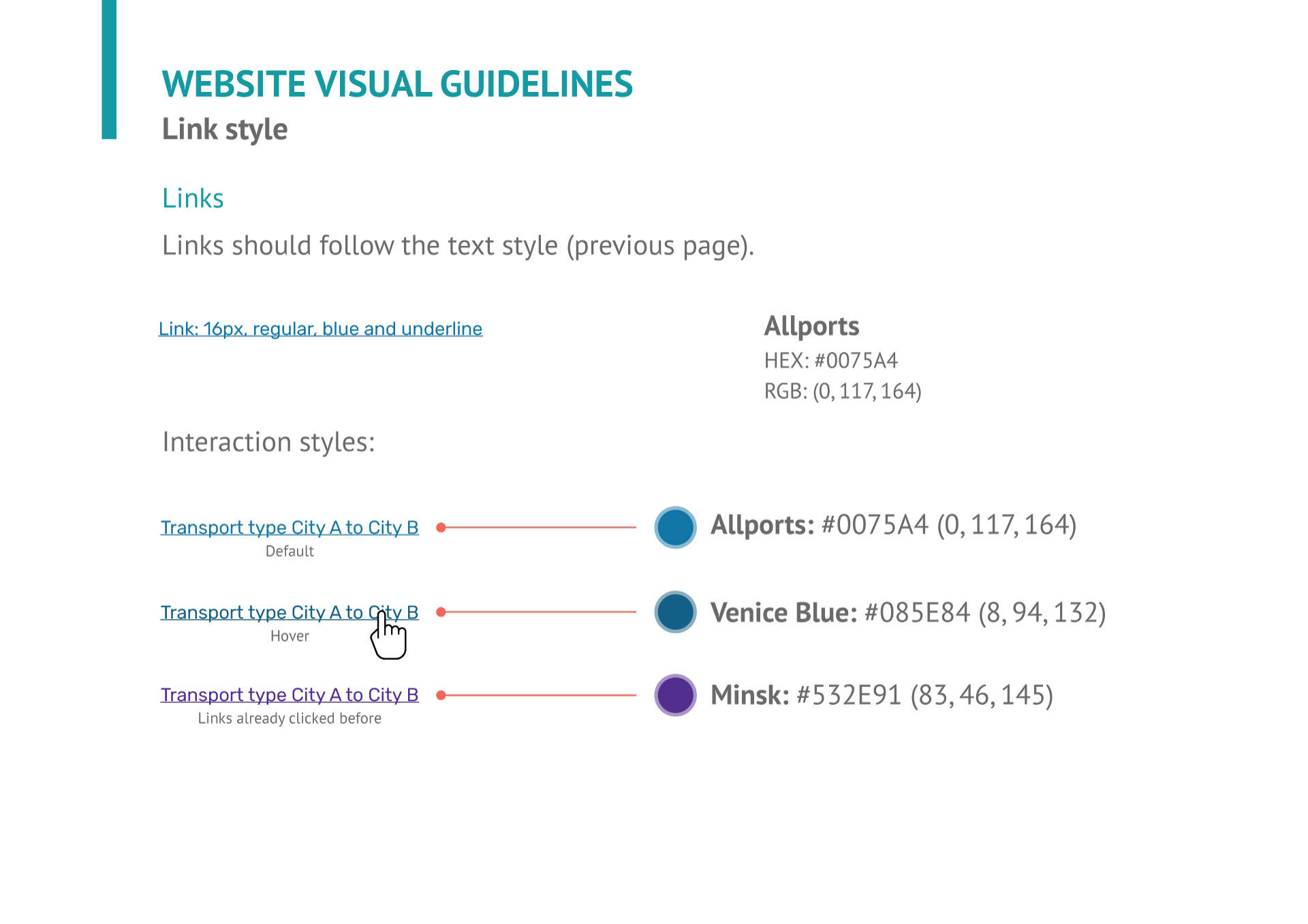
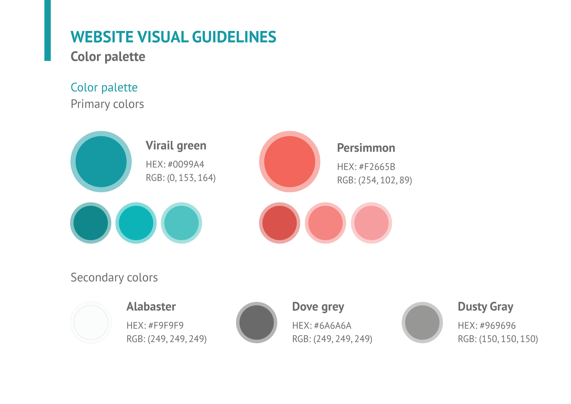
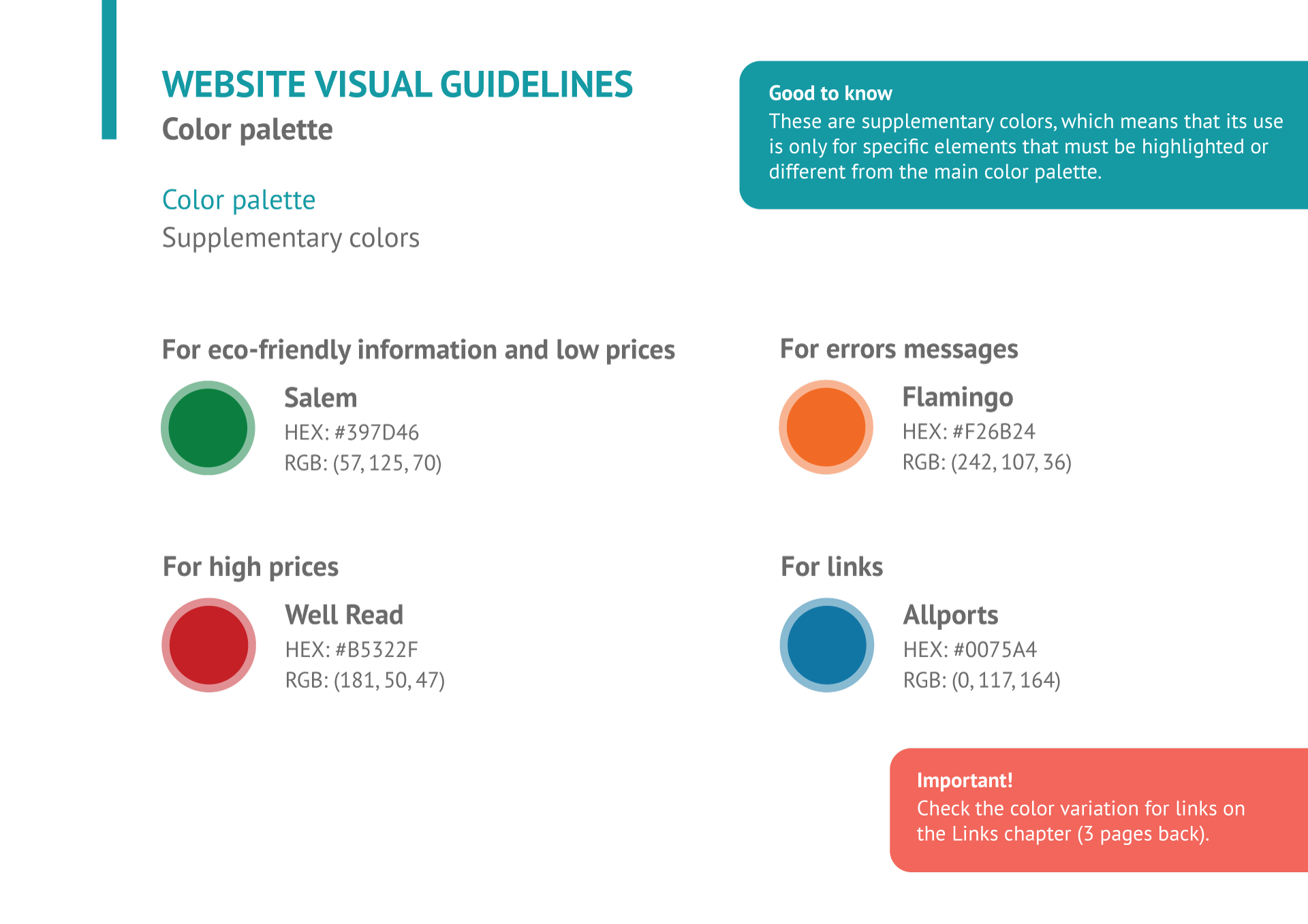
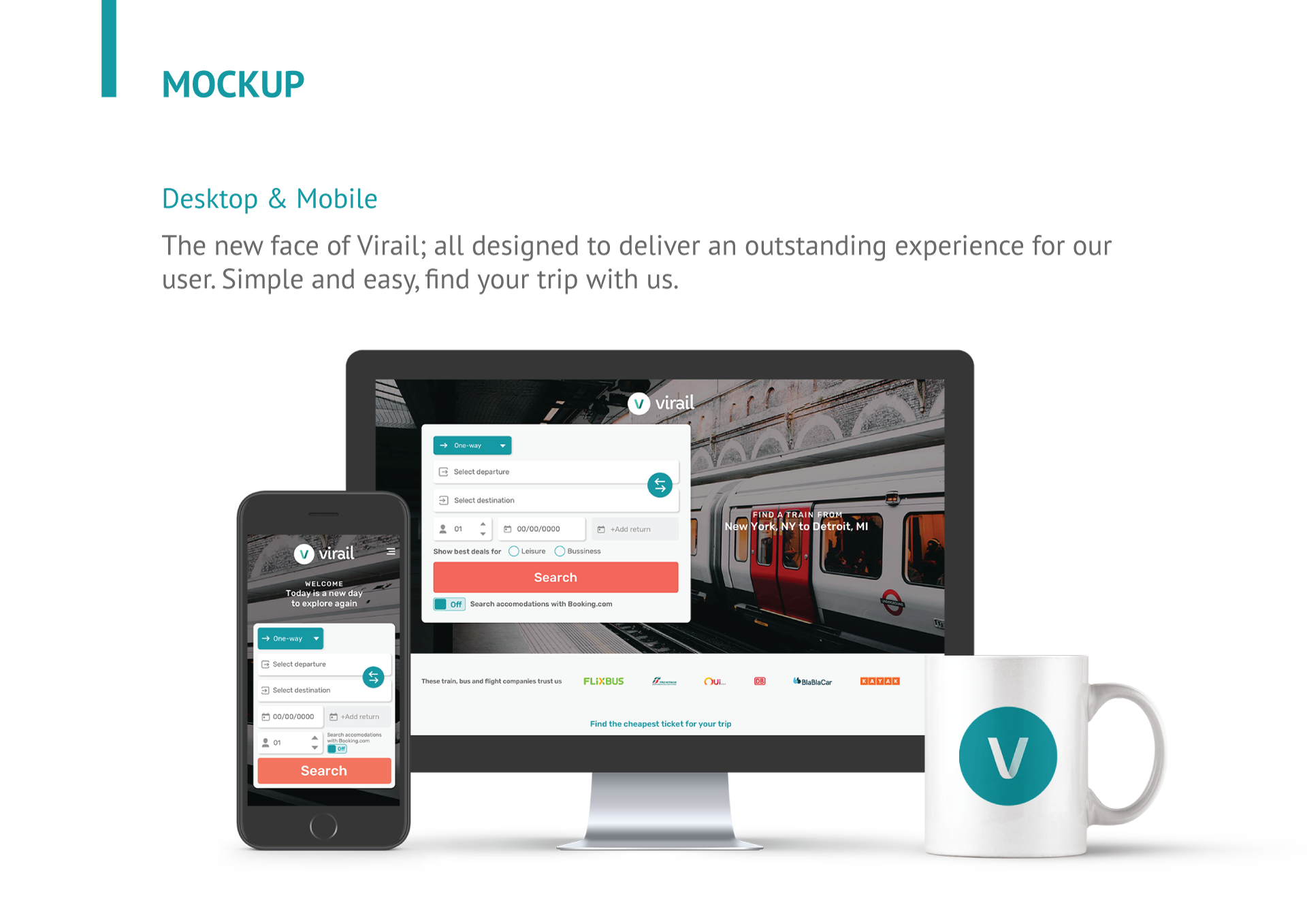
To fix the unmemorable issue, I prepared a new visual branding for Virail. Thanks to my graphic design background, I was able to combine my visual and UI skills to create a brand book and a complete Design System on Figma.
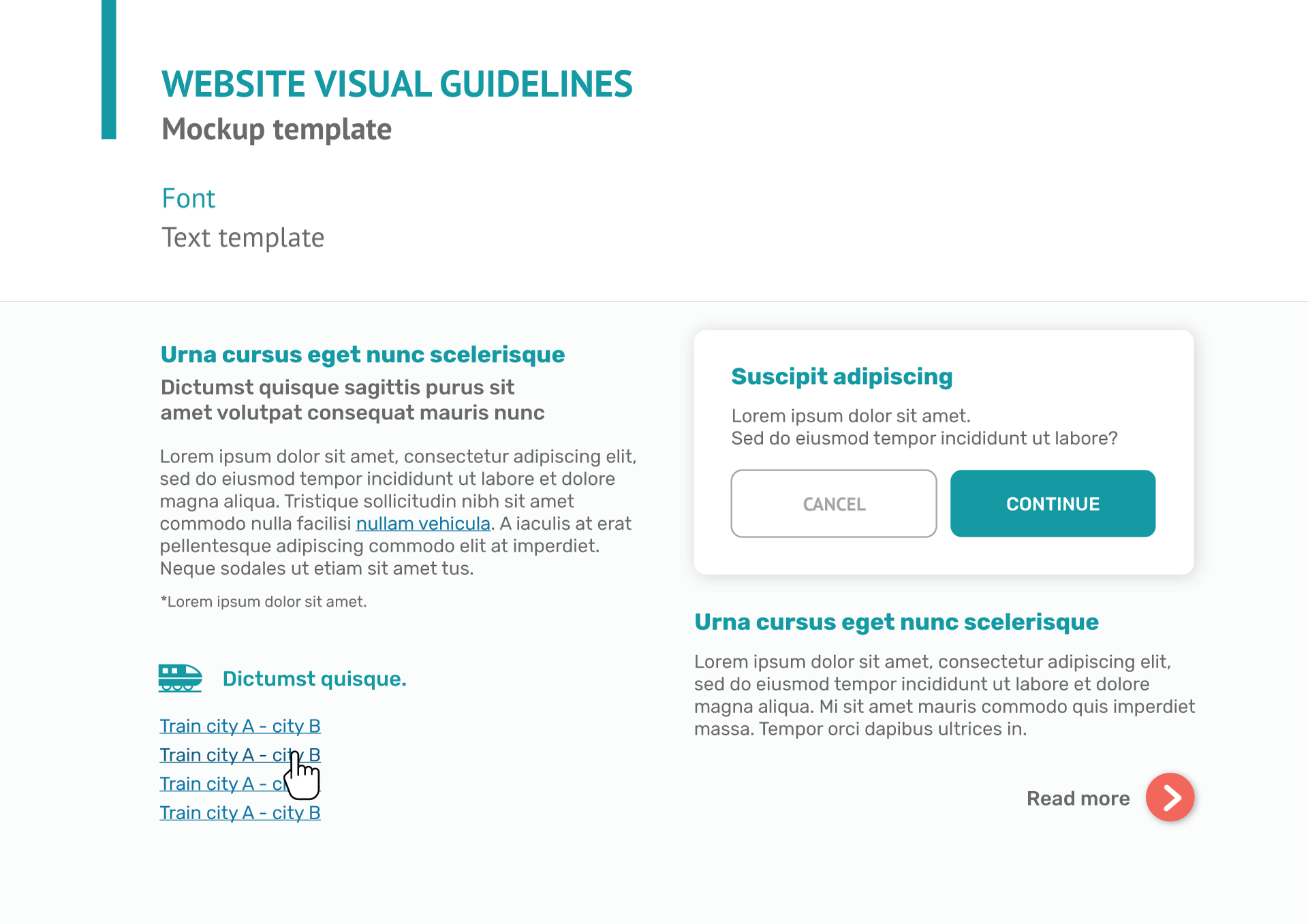
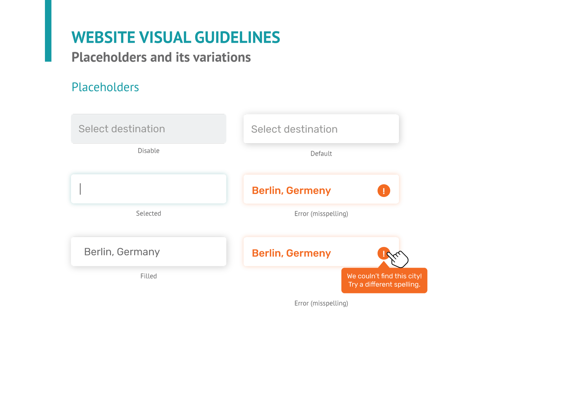
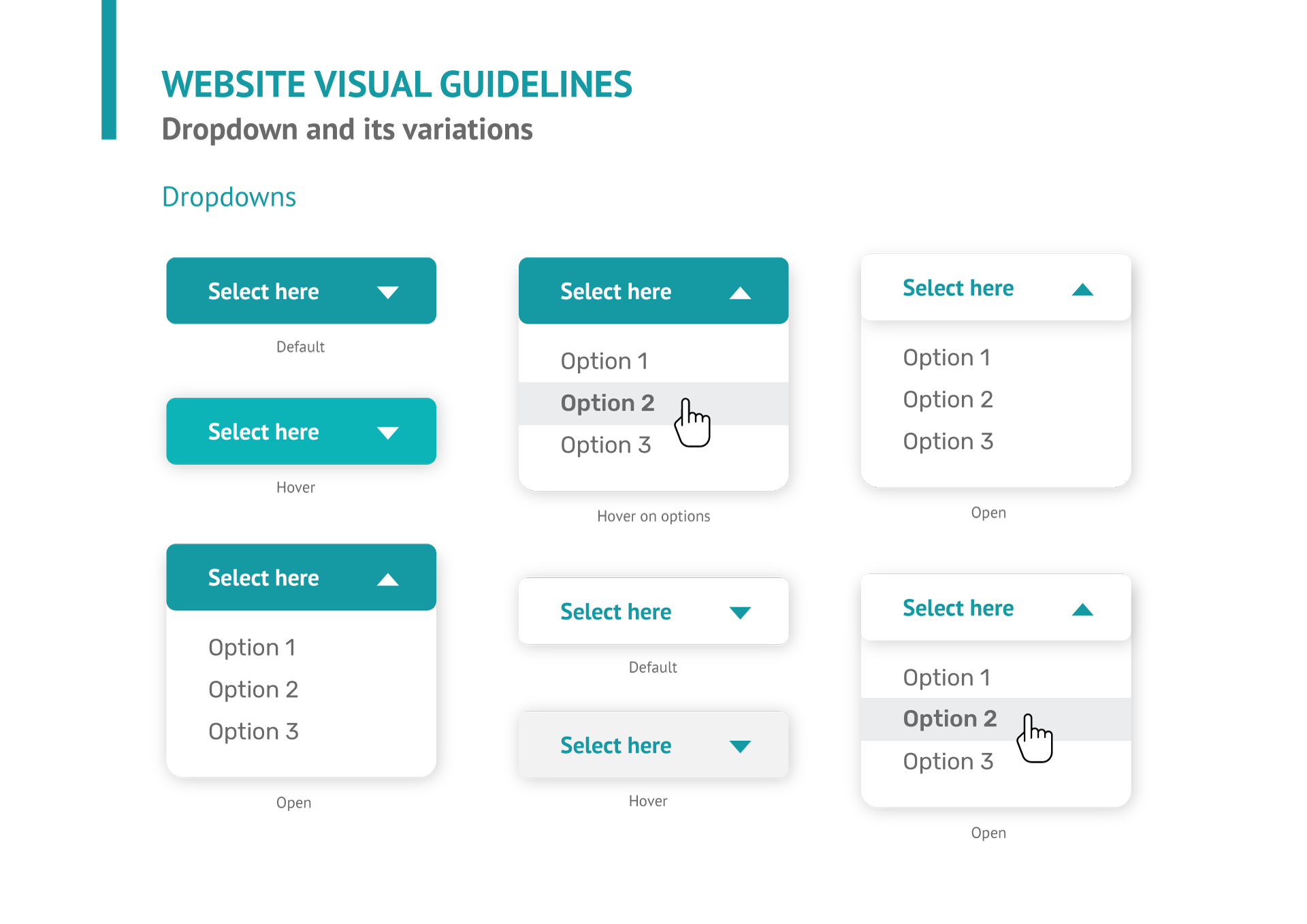
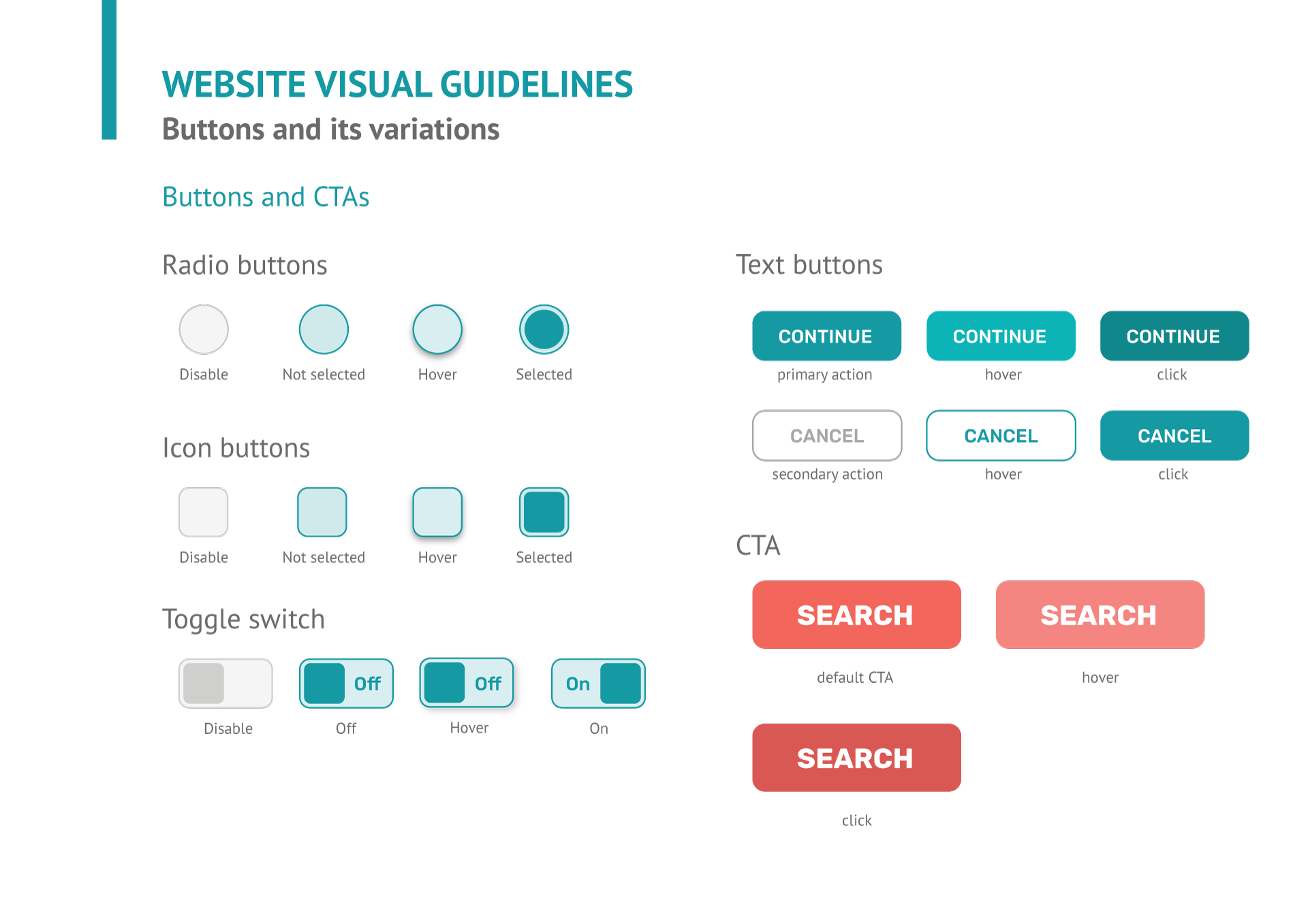
Ok, how did it looked?
Alright, alright, I’ll show you, don’t worry! Let’s review it together section by section:

HERO SECTION
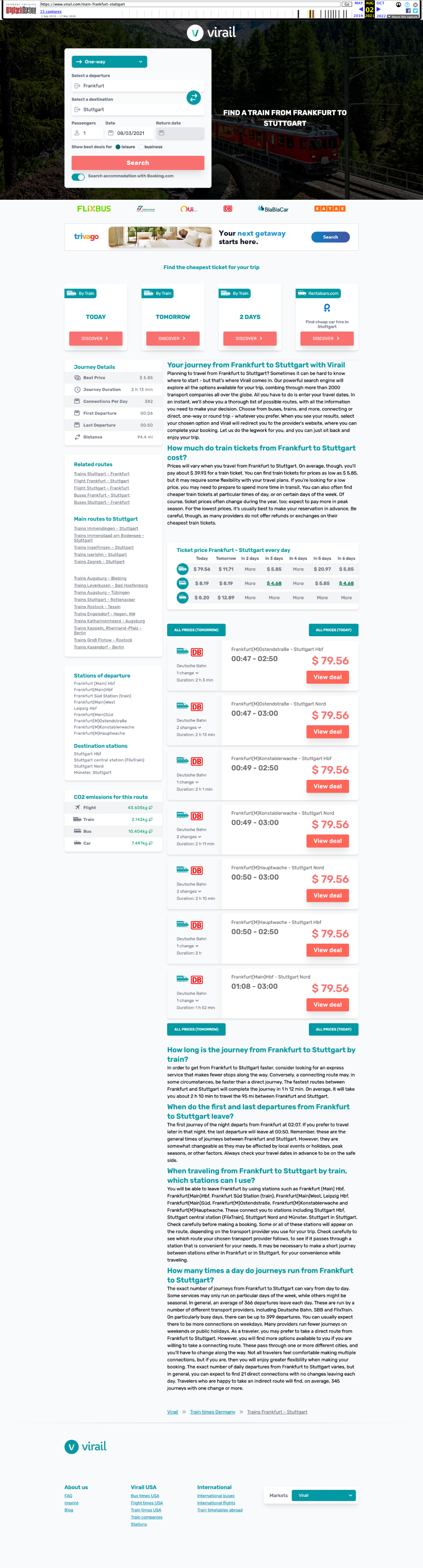
✅ The search field was reconstructed to be the main spotlight on the Hero section, as a big card on the left. All placeholders are now compact and clear to see.

QUICK INFORMATION
✅ Trusted companies, space for ad and a new feature showing your quickest options for the next days. It’s a shorter version of the price table that we wanted to test out in a hot zone.
PRICE TABLE
✅ This feature made Virail apart from their competitors. It’s a simple table quickly comparing day prices by locomotion type.This feature should remain and be updated.
USPs
Highlight of what to get from the service processing
CUT TOLERANCE
Visual guide showing the different cut tolerances
CONTACT + FOOTER
Reassure user by providing contact information
What were the next steps?
After this Redesign project was done I decided to join another company, so I didn't have the opportunity to follow up. My plans for the next phase would be:
✅ Eye tracking
Monitor the eye tracking system (Hotjar) over the website and check how the user behaves while navigating - most important points being:
- Completing user journey in less than ~4 clicks;
- Check for possible bugs;
- Analyse the user usability of the search field
✅ Online Qualitative Survey
Set up a pop-up survey to understand user impressions over the new design such as:
- How much the design affected your experience while navigating?
- Did you managed to find good ticket deals?
- What is more important to you when searching for tickets? (price, duration of trip, company, means of transportation)
✅ A/B Testing
Depending on the eye tracking results and business goal, some A/B testing would be necessary to play around with the information hierarchy to get the best arrangement that allows the user to easily find informations
✅ Data Analysis
The metric of returned users is vital to analyse after some months, proving that the brand is memorable and the redesign improved the user experience. Also check with the sponsors the rate of users actually making the purchase in their website
✅ User Interviews
After at least 3 months, some user interviews could be conducted to find out the level of success regarding branding awareness, check if all user needs are being met and listen for pain points while navigating
Wanna have a success project like this for your business?
Get in touch and I can tell you more about this project!Let's find out how I can bring the same effort, energy and skills into your company.


Do you want to know more about me? Check my CV now!
Everything you need to know about me as a professional is one click away.
Preview my CV ↗
Made with Figma, 💖 and lots of ☕ • © 2025 Rebeca Natalie
Rebeca Natalie,
UX/UI Designer
← Back to the Homepage
How I transformed an entire product, from branding to smooth user experience
Challenge:Virail GmbH is a trip ticket search engine, made for travellers find and book the best option for their trip. Either you're traveling by car, train, bus or plane, Virail will bring you in a plate the best tickets for you to book so you can have a better informed choice.
What's the catch?Users didn't even remember they used Virail's services for their travel plans. They would visit the website, maybe even going through the purchase but they didn't recall using Virail.
How to fix that?Because of that, they hired me (hello there) to figure out how to make Virail relevant and memorable and find out how could they solve real problems for their users.
How to even start?
Never have I ever heard about something like this. How come users didn't remember using their services? So the logic way was to check data.Once I joined, I wanted to understand where the request of redesign was coming. Digging through folders and documentation, I found out an external agency's report on user interviews. From that, I got what I needed to know:
👤 Unmemorable experience
The reports showed that it was necessary to show the Virail's website again for the user, because they didn't recall using it.In terms of digital experience, is like meeting someone and interact with them long enough until it’s too awkward to ask their name again.
ℹ️ Poor prioritization
The content on the most important pages weren't following any specific hierarchy, making users feel overwhelmed and confused, quickly abandoning the website.The rate of permanency at the search engine page was of 4 or less seconds.
😵💫 Overcomplicated user journey
Low rate of users completing the user journey due to too many clicks and steps before completing a purchase.Eye tracking tool (Hotjar) indicated that users were having trouble finding the right CTAs (they were looking everywhere but the button) to complete a purchase. That’s an UX 101 issue, I’ll tell ya.
📱 Poor mobile responsiveness
Most elements and long content on mobile version were broken or pushing most important info to the bottom of the page.
Exploration phase
Now that I had real data from real users, I had a starting point. Focused on the most important landing pages (homepage, results page and thank you page), I started flagging:
- Hot zones;
- Irrelevant information;
- Potential improvements

HERO SECTION
🚩 A big plain header lacking a more interesting element or visual to welcome the user as soon as it lands here - it kept the brand discreet and leading to a boring experience

QUICK INFORMATION
🤔 For SEO purposes, most pages had lots of content regarding the user’s search. It’s a nice to have, but it was misplaced because it’s blocking the real information the user wanted: their trip options
PRICE TABLE
✅ This feature made Virail apart from their competitors. It’s a simple table quickly comparing day prices by locomotion type.This feature should remain and be updated.
USPs
Highlight of what to get from the service processing
CUT TOLERANCE
Visual guide showing the different cut tolerances
CONTACT + FOOTER
Reassure user by providing contact information
UI Styles
To fix the unmemorable issue, I prepared a new visual branding for Virail.Thanks to my graphic design background, I was able to combine my visual and UI skills to create a brand book and a complete Design System on Figma. It was important to create a clear manual for the company & developers that would soon use my documentation for their part of the work.
Ok, how did it looked?
Alright, alright, I’ll show you, don’t worry!Let’s review it together section by section:

HERO SECTION
✅ The search field was reconstructed to be the main spotlight on the Hero section, as a big card on the left. All placeholders are now compact and clear to see.

QUICK INFORMATION
✅ Trusted companies, space for ad and a new feature showing your quickest options for the next days. It’s a shorter version of the price table that we wanted to test out in a hot zone.
PRICE TABLE
✅ This feature made Virail apart from their competitors. It’s a simple table quickly comparing day prices by locomotion type.This feature should remain and be updated.
USPs
Highlight of what to get from the service processing
CUT TOLERANCE
Visual guide showing the different cut tolerances
CONTACT + FOOTER
Reassure user by providing contact information
What were the next steps?
After this Redesign project was done I decided to join another company, so I didn't have the opportunity to follow up. My plans for the next phase would be:
✅ Eye tracking
Monitor the eye tracking system (Hotjar) over the website and check how the user behaves while navigating - most important points being:
- Completing user journey in less than ~4 clicks;
- Check for possible bugs;
- Analyse the user usability of the search field
✅ Online Qualitative Survey
Set up a pop-up survey to understand user impressions over the new design such as:
- How much the design affected your experience while navigating?
- Did you managed to find good ticket deals?
- What is more important to you when searching for tickets? (price, duration of trip, company, means of transportation)
✅ A/B Testing
Depending on the eye tracking results and business goal, some A/B testing would be necessary to play around with the information hierarchy to get the best arrangement that allows the user to easily find informations
✅ Data Analysis
The metric of returned users is vital to analyse after some months, proving that the brand is memorable and the redesign improved the user experience. Also check with the sponsors the rate of users actually making the purchase in their website
✅ User Interviews
After at least 3 months, some user interviews could be conducted to find out the level of success regarding branding awareness, check if all user needs are being met and listen for pain points while navigating

Wanna have a success project like this for your business?
Get in touch and I can tell you more about this project!Let's find out how I can bring the same effort, energy and skills into your company.
Do you want to know more about me? Check my CV now!
Everything you need to know about me as a professional is one click away.
Preview my CV ↗
Made with Figma, 💖 and lots of ☕ • © 2025 Rebeca Natalie
Rebeca Natalie,
UX/UI Designer
← Back to the Homepage
How I transformed an entire product, from branding to smooth user experience
Challenge:Virail GmbH is a trip ticket search engine, made for travellers find and book the best option for their trip. Either you're traveling by car, train, bus or plane, Virail will bring you in a plate the best tickets for you to book so you can have a better informed choice.
What's the catch?Users didn't even remember they used Virail's services for their travel plans. They would visit the website, maybe even going through the purchase but they didn't recall using Virail.
How to fix that?Because of that, they hired me (hello there) to figure out how to make Virail relevant and memorable and find out how could they solve real problems for their users.
What was the issue?
Never have I ever heard about something like this. How come users didn't remember using their services? So the logic way was to check data.Once I joined, I wanted to understand where the request of redesign was coming. Digging through folders and documentation, I found out an external agency's report on user interviews. From that, I got what I needed to know:
👤 Unmemorable experience
The reports showed that it was necessary to show the Virail's website again for the user, because they didn't recall using it.In terms of digital experience, is like meeting someone and interact with them long enough until it’s too awkward to ask their name again.
ℹ️ Poor prioritization
The content on the most important pages weren't following any specific hierarchy, making users feel overwhelmed and confused, quickly abandoning the website.The rate of permanency at the search engine page was of 4 or less seconds.
😵💫 Overcomplicated user journey
Low rate of users completing the user journey due to too many clicks and steps before completing a purchase.Eye tracking tool (Hotjar) indicated that users were having trouble finding the right CTAs (they were looking everywhere but the button) to complete a purchase.That’s an UX 101 issue, I’ll tell ya.
📱 Poor mobile responsiveness
Most elements and long content on mobile version were broken or pushing most important info to the bottom of the page.
Time to flag
Now that I had real data from real users, I had a starting point. Focused on the most important landing pages (homepage, results page and thank you page), I started flagging:
- Hot zones;
- Irrelevant information;
- Potential improvements

HERO SECTION
🚩 A big plain header lacking a more interesting element or visual to welcome the user as soon as it lands here - it kept the brand discreet and leading to a boring experience

QUICK INFORMATION
🤔 For SEO purposes, most pages had lots of content regarding the user’s search. It’s a nice to have, but it was misplaced because it’s blocking the real information the user wanted: their trip options
PRICE TABLE
✅ This feature made Virail apart from their competitors. It’s a simple table quickly comparing day prices by locomotion type.This feature should remain and be updated.
USPs
Highlight of what to get from the service processing
CUT TOLERANCE
Visual guide showing the different cut tolerances
CONTACT + FOOTER
Reassure user by providing contact information
UI Styles
To fix the unmemorable issue, I prepared a new visual branding for Virail.Thanks to my graphic design background, I was able to combine my visual and UI skills to create a brand book and a complete Design System on Figma. It was important to create a clear manual for the company & developers that would soon use my documentation for their part of the work.
Ok, how did it looked?
Alright, alright, I’ll show you, don’t worry! Let’s review it together section by section:
HERO SECTION
✅ The search field was reconstructed to be the main spotlight on the Hero section, as a big card on the left. All placeholders are now compact and clear to see.

QUICK INFORMATION
✅ Trusted companies, space for ad and a new feature showing your quickest options for the next days. It’s a shorter version of the price table that we wanted to test out in a hot zone.
PRICE TABLE
✅ This feature made Virail apart from their competitors. It’s a simple table quickly comparing day prices by locomotion type.This feature should remain and be updated.
USPs
Highlight of what to get from the service processing
CUT TOLERANCE
Visual guide showing the different cut tolerances
CONTACT + FOOTER
Reassure user by providing contact information
What were the next steps?
After this Redesign project was done I decided to join another company, so I didn't have the opportunity to follow up. My plans for the next phase would be:
✅ Eye tracking
Monitor the eye tracking system (Hotjar) over the website and check how the user behaves while navigating - most important points being:
- Completing user journey in less than ~4 clicks;
- Check for possible bugs;
- Analyse the user usability of the search field
✅ Online Qualitative Survey
Set up a pop-up survey to understand user impressions over the new design such as:
- How much the design affected your experience while navigating?
- Did you managed to find good ticket deals?
- What is more important to you when searching for tickets? (price, duration of trip, company, means of transportation)
✅ A/B Testing
Depending on the eye tracking results and business goal, some A/B testing would be necessary to play around with the information hierarchy to get the best arrangement that allows the user to easily find informations
✅ Data Analysis
The metric of returned users is vital to analyse after some months, proving that the brand is memorable and the redesign improved the user experience. Also check with the sponsors the rate of users actually making the purchase in their website
✅ User Interviews
After at least 3 months, some user interviews could be conducted to find out the level of success regarding branding awareness, check if all user needs are being met and listen for pain points while navigating

Wanna have a success project like this for your business?
Get in touch and I can tell you more about this project!Let's find out how I can bring the same effort, energy and skills into your company.



Do you want to know more about me? Check my CV now!
Everything you need to know about me as a professional is one click away.
Preview my CV ↗
Made with Figma, 💖 and lots of ☕ • © 2025 Rebeca Natalie