Home > Travel Search Engine Redesign
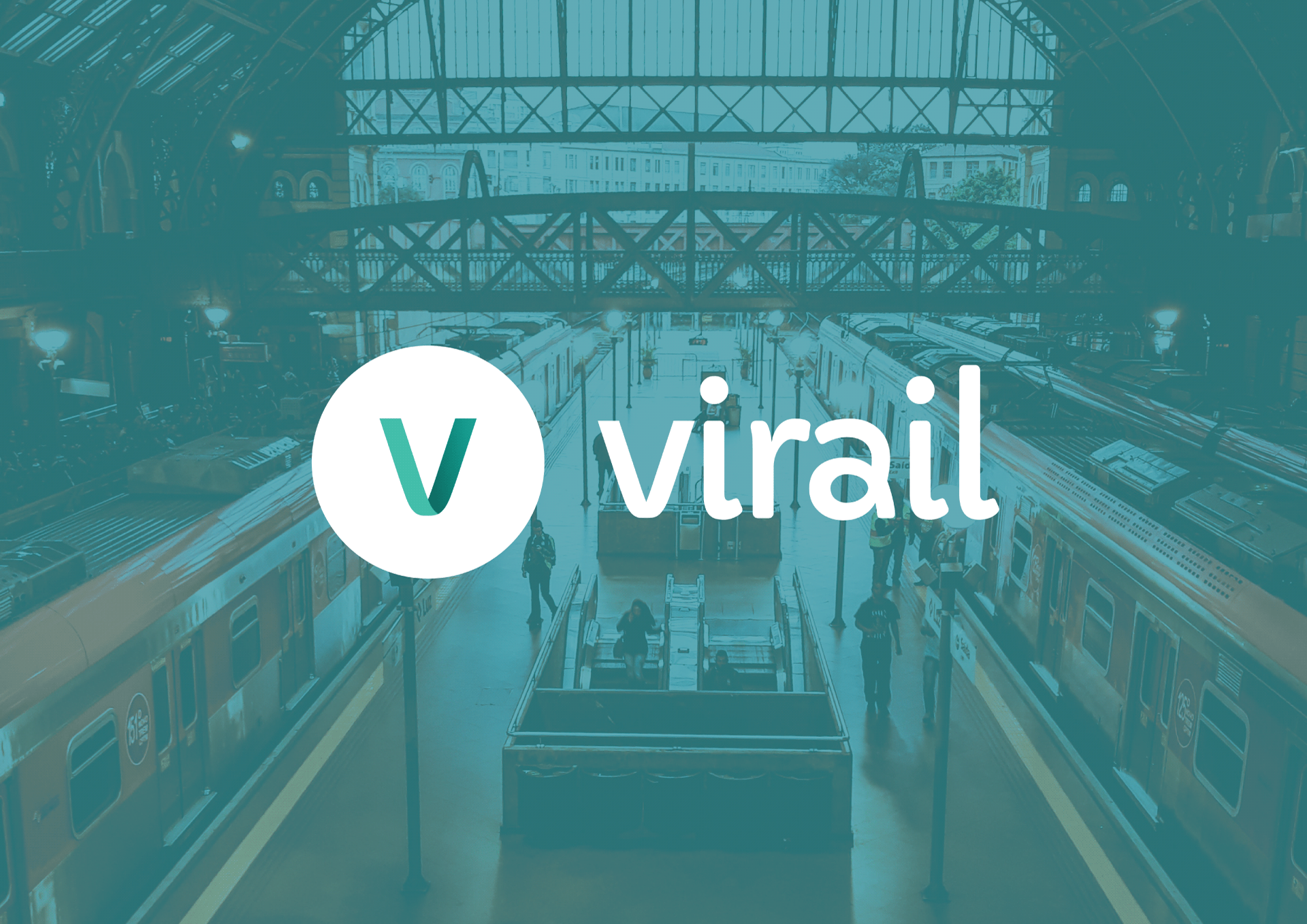
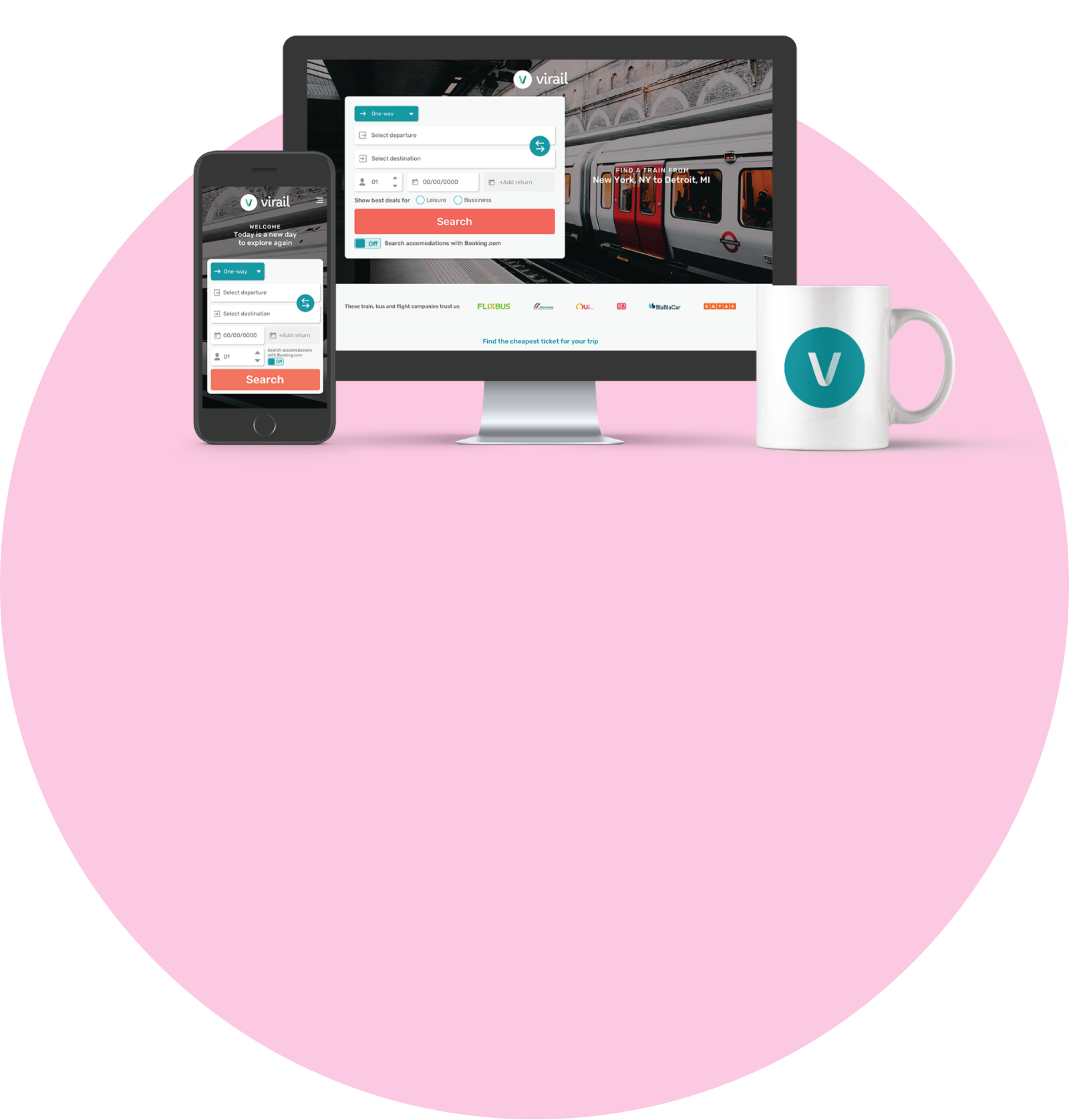
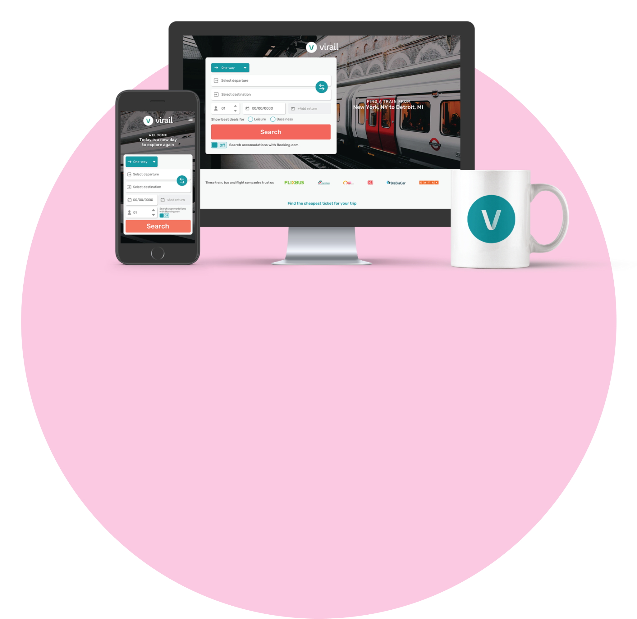
Travel Search Engine Redesign
Complete visual UI redesign of a travel search engine, focusing on user-journey, modern design principles, and user trust.
Skills and tools used in this project:
User Interviews
Visual Hierarchy
Design System
Brand Identity
Sketch
Zeplin
Adobe Photoshop
Adobe Illustrator
Adobe InDesign
Problems
An external agency conducted a series of user interviews, collected website analytics and then presented to us the major pain points that kept users from buying train, bus and flight tickets through Virail’s website:

Poor prioritization
The content were not following any specific hierarchy, making users feel overwhelmed and confused, quickly abandoning the website*
*Rate of 4 seconds or less of permanency at the homepage, which indicates confusion or lack of cleareness
Overcomplicated user journey
Low rate* of users completing the user journey due too many clicks and steps before completing a purchase
*Eye tracking tool indicated that users were having trouble finding the right CTAs to complete the user journey and finishing purchase
Poor mobile responsiveness
Most elements and huge content on the mobile version were broken or pushing most important information to the bottom of the page
Unmemorable experience
Many users, once interviewed, didn’t remember visiting and navigating Virail’s website*
*At the beginning of the calls, the interviewer didn’t recognised the company and it was necessary showing the website again to make sure they remembered

Challenge
To increase traffic on the website, the redesign focused on visual hierarchy where only the most important information is shown on the right time for the user, decrease the number of clicks to complete the main user journey, rearrange the mobile version design and rethink the brand visual, to make sure users have a memorable experience.
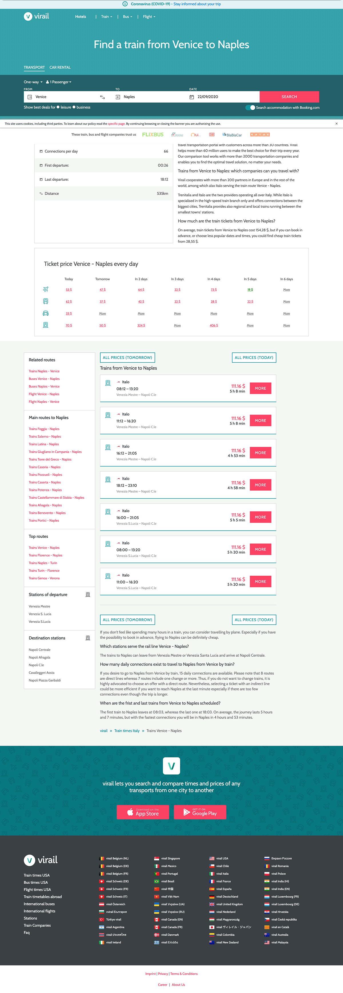
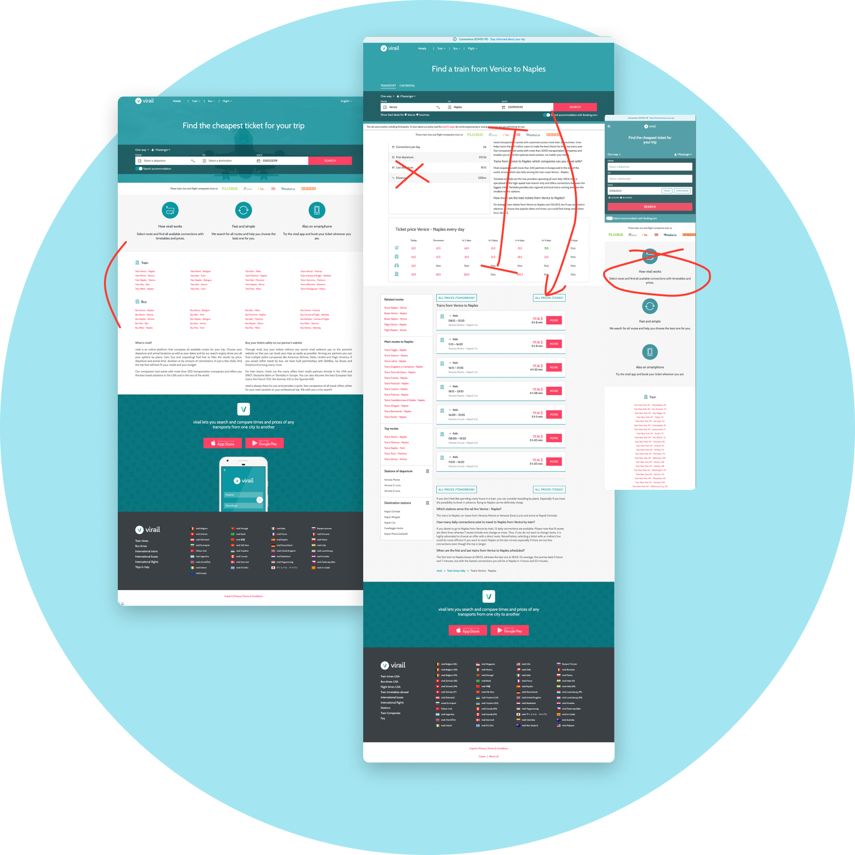
The most important page was the route landing page, where the user first lands at the Virail’s website, after searching for their desirable route on Google. After the research data analytics, I could point out the major issues the main page had and how could it be costing Virail its users:
1
2
3
4
1
A plain big header that lacks a more interesting element or visual were the first thing the user sees when they first land at the page - it kept the brand unrecognisable and a boring experience
2
For SEO purposes, most pages had lots of content regarding the user’s search. Without a proper polish, the text was heavy to read and became a blind spot for the user
3
This feature was an interesting element that set Virail apart from its competition - a way to quickly check and compare different transportation prices for the next days for a specific route. This kind of feature was also a blind spot, since users would quickly skip this section (the hypothesis were that the number 2 had tired the user up, making them numbly scroll down the page)
4
The search result was simple and direct, but also lacking some important information about the trip that could be interesting for the user.
UI Styles
From the most important page of the user journey, I started by defining a new visual for the brand. I created a brand guide book, where all aspects of the business and brand where defined. By selecting a new font style that had all language’s characters, multiple font thickness options and a new colour palette, I could start creating a new design system.
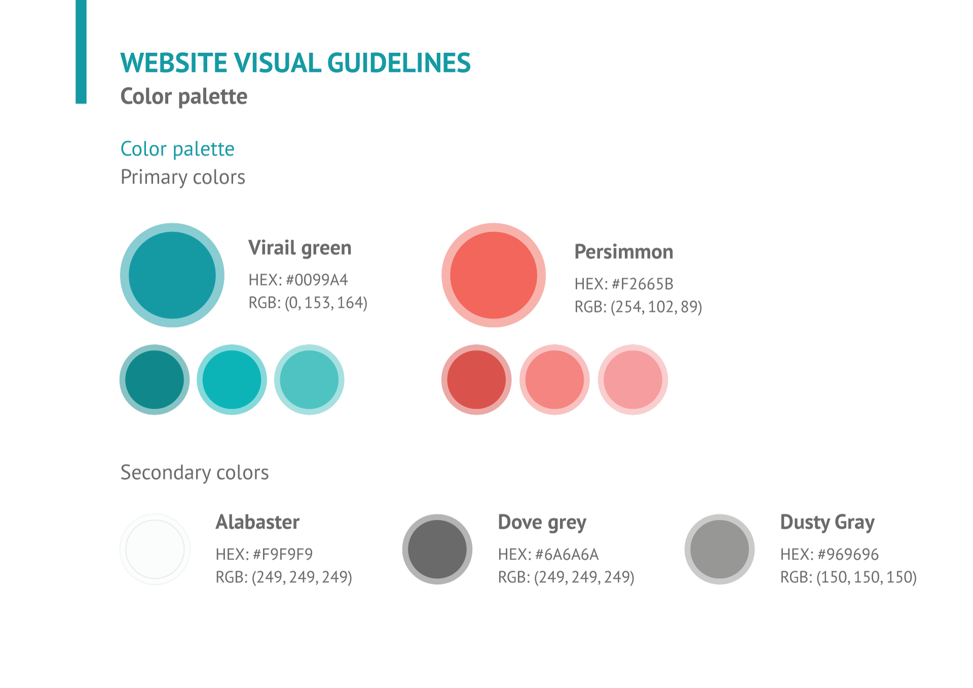
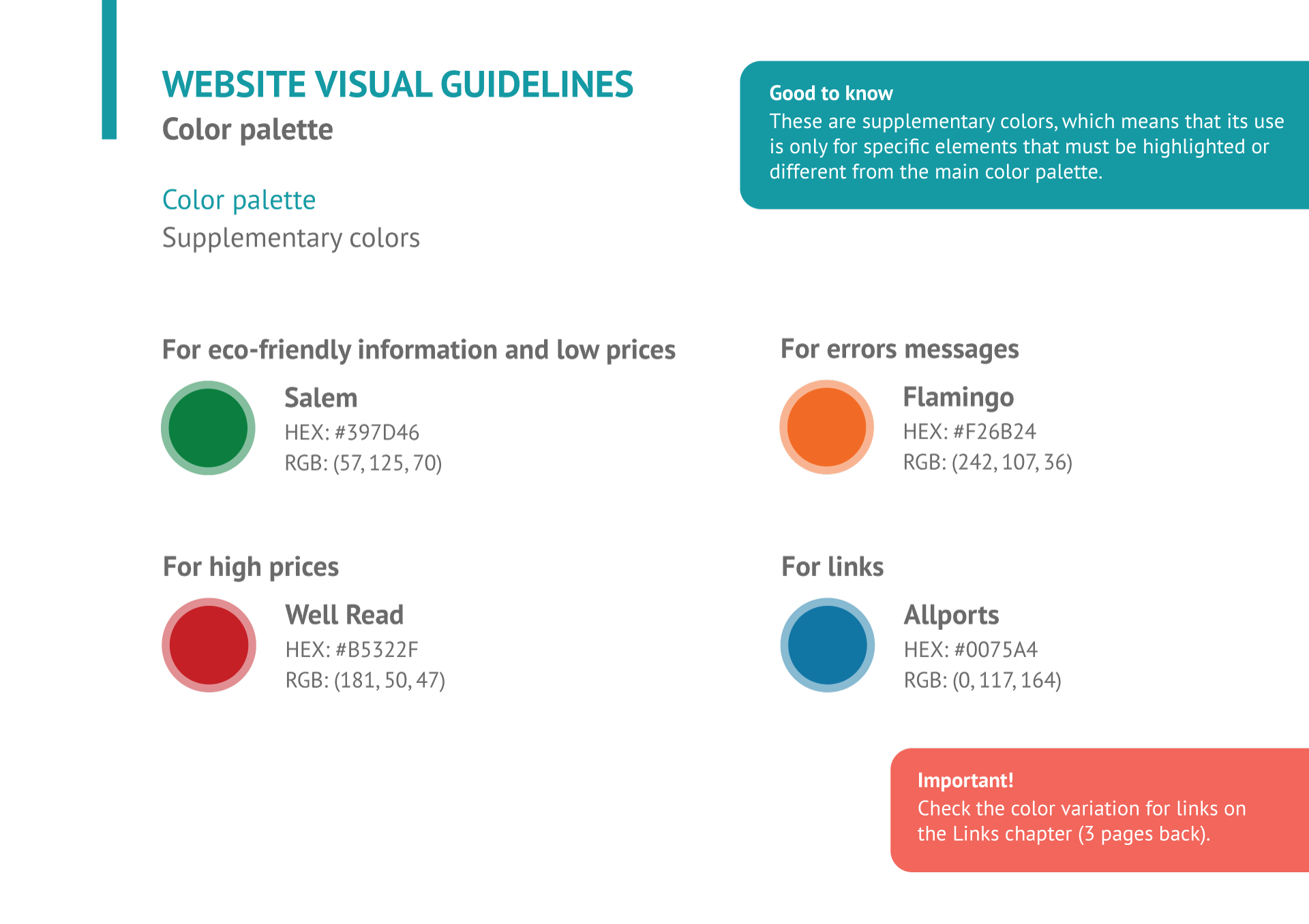
UI Components
After a defined brand identity, it was clear for me how to start building up a design system for Virail - the tone of voice was friendly and helpful, while bringing the most important data for the user/traveler. So slightly rounded corners were the solution for all components - being consistent by the font style that also had rounded vertices.
All elements had to have a friendly visual, so the Virail primary colour green came in handy. Because of the many information the page had, I designed cards for a better visual and legibility, so the user can clearly separate elements while navigating and easily finding relevant information for them.
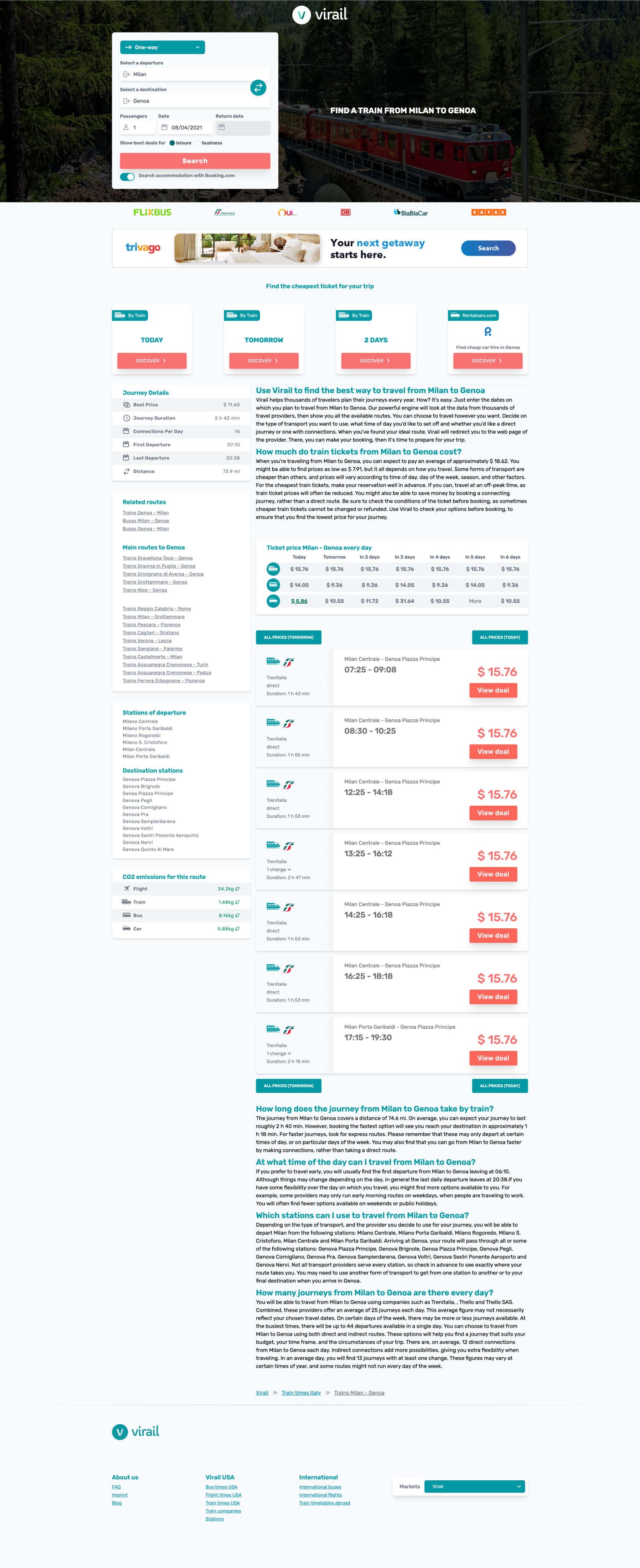
Solution
After brand and design system defined, it was time to structure the website’s hierarchy.
1
3
4
5
6
7
2
1
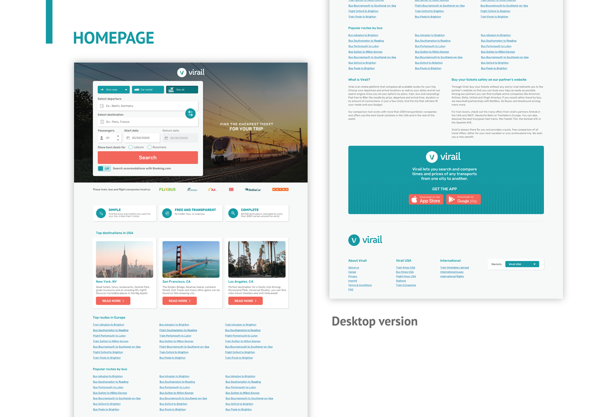
The search field, one of the most important elements of the header, was restructured into a big card component, so the eyes of the user doesn’t have to read a full search field from left to the right side of a big screen. This way all placeholders are more compact and clear to see.
2
I got rid of the plain boring grey and, depending on the landing page, the image background would change. A big title informs the user what route they’re seeing in that page. The whole header was modified in the attempt of catching the user’s attention, hopefully it would create a bigger impact, and they would remember visiting Virail’s website.
3
The interesting feature where you could check tickets for the next days would be divided into two: this section where you could click and check a search page for all tickets of that day and then on number 5, where you could visualise a full table with prices on display. We needed to test out what would users be looking for and what kind of design would get more attention.
4
To make this page discoverable, we should place SEO text here. I formatted the content so it would look more beautiful and practical read, taking advantage of the columns (one for the table at the right and the left one for text), making the content box narrow.
5
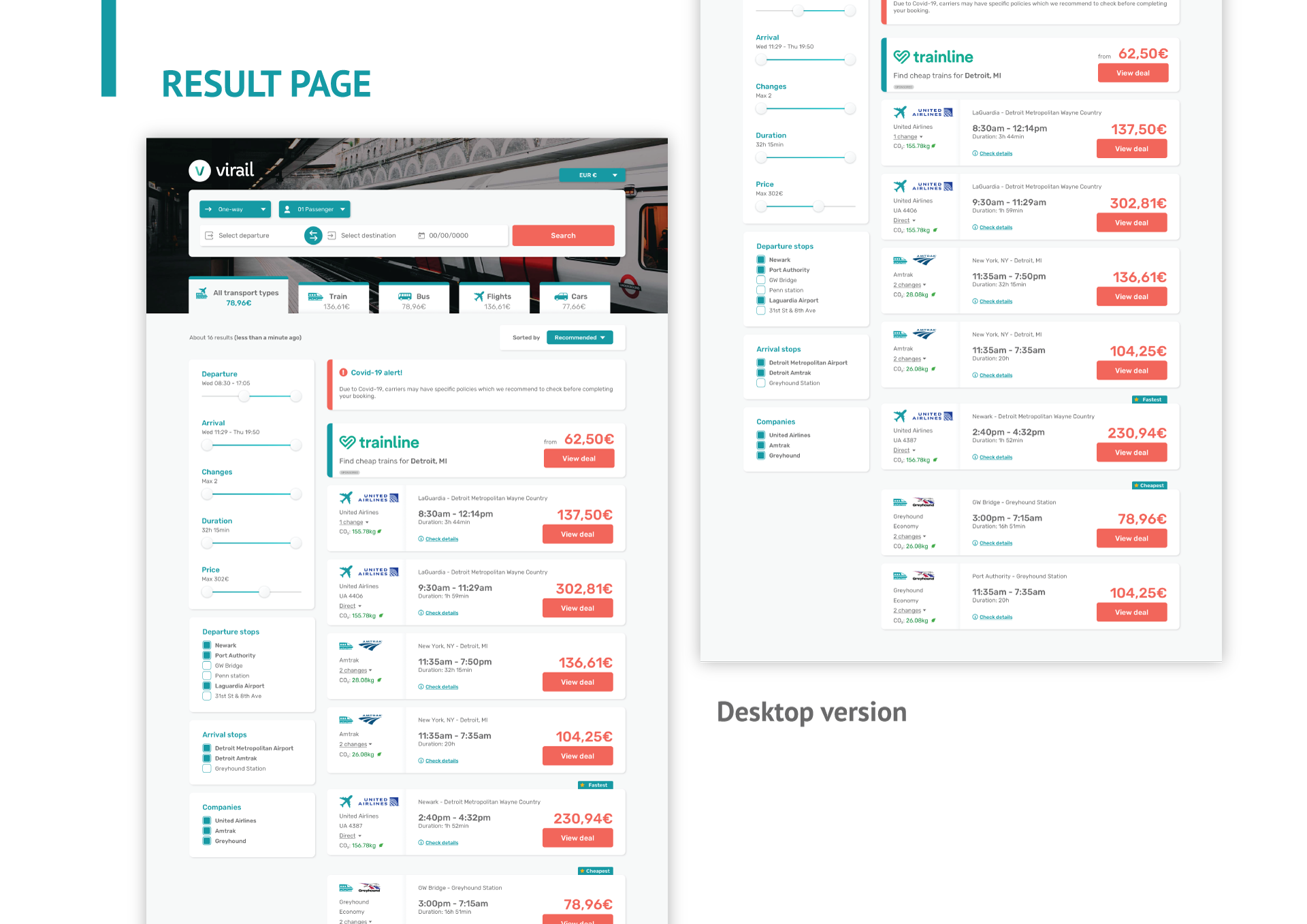
The feature where the user can check prices for the next days divided into two elements. I redesigned the table, adding more clear rolls and icons to decrease amount of unnecessary text.
6
Each ticket card option were also restructured to contain more quick access information and easy to scan and make a decision. The CTA text was also changed to better inform the user what would happen if they clicked the button.
7
The non essential content was placed at the bottom, so it doesn’t stands in the way of the user journey, allowing the user to freely find its way to finding the best ticket offer.
Desktop
version
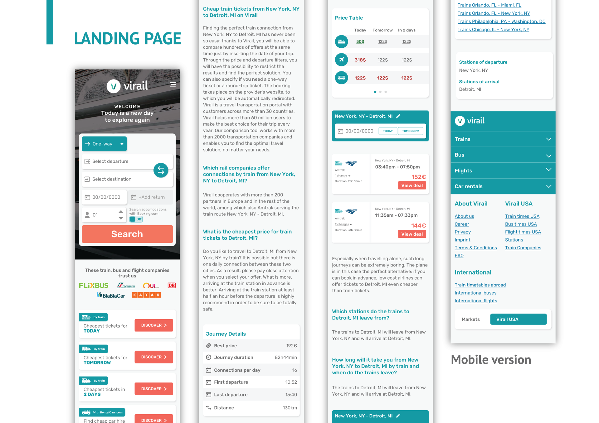
mobile
version
You can scroll this screen!
Homepage
You can scroll this screen!
Search Page
You can scroll this screen!
Landing Page
There’s no scrolling on this screen
Thank You Page
Next step
I didn’t have the opportunity to see the feedback from the users regarding this big project. What I would do is for the next step is set up a series of UX research methods to check out the success of this redesign.

Eye tracking
Monitor the eye tracking system over the website and check how the user behaves while navigating - most important points being:
- Completing user journey in less than ~4 clicks
- Check for possible bugs
- Analyse the user usability of the search field
Online qualitative
survey
Set up a pop-up survey to understand user impressions over the new design such as:
- How much the design affected your experience while navigating?
- Did you managed to find good ticket deals?
- What is more important to you when searching for tickets? (price, duration of trip, company, means of transportation)
A/B testing
Depending on the eye tracking results and business goal, some A/B testing would be necessary to play around with the information hierarchy to get the best arrangement that allows the user to easily find informations
Data analysis
The metric of returned users is vital to analyse after some months, proving that the brand is memorable and the redesign improved the user experience. Also check with the sponsors the rate of users actually making the purchase in their website
User interviews
After at least 3 months, some user interviews could be conducted to find out the level of success regarding branding awareness, check if all user needs are being met and listen for pain points while navigating
Did you like
this project?
Contact me!
I'd love to hear about your vision and explore how we can work together.
Let’s have a chat and find out if we’re a match!


Check out other projects
Made with lots of ☕ and 💖 • © 2025 Rebeca Natalie
Home > Travel Search Engine Redesign
Travel Search Engine Redesign
Complete visual UI redesign of a travel search engine, focusing on user-journey, modern design principles, and user trust.
Skills and tools used in this project:
User Interviews
Visual Hierarchy
Design System
Brand Identity
Sketch
Zeplin
Adobe Photoshop
Adobe Illustrator
Adobe InDesign
Problems
An external agency conducted a series of user interviews, collected website analytics and then presented to us the major pain points that kept users from buying train, bus and flight tickets through Virail’s website:
Poor prioritization
The content were not following any specific hierarchy, making users feel overwhelmed and confused, quickly abandoning the website*
*Rate of 4 seconds or less of permanency at the homepage, which indicates confusion or lack of cleareness
Overcomplicated user journey
Low rate* of users completing the user journey due too many clicks and steps before completing a purchase
*Eye tracking tool indicated that users were having trouble finding the right CTAs to complete the user journey and finishing purchase
Poor mobile responsiveness
Most elements and huge content on the mobile version were broken or pushing most important information to the bottom of the page
Unmemorable experience
Many users, once interviewed, didn’t remember visiting and navigating Virail’s website*
*At the beginning of the calls, the interviewer didn’t recognised the company and it was necessary showing the website again to make sure they remembered
Challenge
To increase traffic on the website, the redesign focused on visual hierarchy where only the most important information is shown on the right time for the user, decrease the number of clicks to complete the main user journey, rearrange the mobile version design and rethink the brand visual, to make sure users have a memorable experience.
The most important page was the route landing page, where the user first lands at the Virail’s website, after searching for their desirable route on Google. After the research data analytics, I could point out the major issues the main page had and how could it be costing Virail its users:
1
2
3
4
1
A plain big header that lacks a more interesting element or visual were the first thing the user sees when they first land at the page - it kept the brand unrecognisable and a boring experience
2
For SEO purposes, most pages had lots of content regarding the user’s search. Without a proper polish, the text was heavy to read and became a blind spot for the user
3
This feature was an interesting element that set Virail apart from its competition - a way to quickly check and compare different transportation prices for the next days for a specific route. This kind of feature was also a blind spot, since users would quickly skip this section (the hypothesis were that the number 2 had tired the user up, making them numbly scroll down the page)
4
The search result was simple and direct, but also lacking some important information about the trip that could be interesting for the user.
UI Components
After a defined brand identity, it was clear for me how to start building up a design system for Virail - the tone of voice was friendly and helpful, while bringing the most important data for the user/traveler. So slightly rounded corners were the solution for all components - being consistent by the font style that also had rounded vertices.
All elements had to have a friendly visual, so the Virail primary colour green came in handy. Because of the many information the page had, I designed cards for a better visual and legibility, so the user can clearly separate elements while navigating and easily finding relevant information for them.
Solution
After brand and design system defined, it was time to structure the website’s hierarchy.
1
3
4
5
6
7
2
1
The search field, one of the most important elements of the header, was restructured into a big card component, so the eyes of the user doesn’t have to read a full search field from left to the right side of a big screen. This way all placeholders are more compact and clear to see.
2
I got rid of the plain boring grey and, depending on the landing page, the image background would change. A big title informs the user what route they’re seeing in that page. The whole header was modified in the attempt of catching the user’s attention, hopefully it would create a bigger impact, and they would remember visiting Virail’s website.
3
The interesting feature where you could check tickets for the next days would be divided into two: this section where you could click and check a search page for all tickets of that day and then on number 5, where you could visualise a full table with prices on display. We needed to test out what would users be looking for and what kind of design would get more attention.
4
To make this page discoverable, we should place SEO text here. I formatted the content so it would look more beautiful and practical read, taking advantage of the columns (one for the table at the right and the left one for text), making the content box narrow.
5
The feature where the user can check prices for the next days divided into two elements. I redesigned the table, adding more clear rolls and icons to decrease amount of unnecessary text.
6
Each ticket card option were also restructured to contain more quick access information and easy to scan and make a decision. The CTA text was also changed to better inform the user what would happen if they clicked the button.
7
The non essential content was placed at the bottom, so it doesn’t stands in the way of the user journey, allowing the user to freely find its way to finding the best ticket offer.
Desktop version
mobile version
You can scroll this screen!
Homepage
You can scroll this screen!
Search Page
You can scroll this screen!
Landing Page
There’s no scrolling on this screen
Thank You Page
Next step
I didn’t have the opportunity to see the feedback from the users regarding this big project. What I would do is for the next step is set up a series of UX research methods to check out the success of this redesign.
Eye tracking
Monitor the eye tracking system over the website and check how the user behaves while navigating - most important points being:
- Completing user journey in less than ~4 clicks
- Check for possible bugs
- Analyse the user usability of the search field
Online qualitative survey
Set up a pop-up survey to understand user impressions over the new design such as:
- How much the design affected your experience while navigating?
- Did you managed to find good ticket deals?
- What is more important to you when searching for tickets? (price, duration of trip, company, means of transportation)
A/B testing
Depending on the eye tracking results and business goal, some A/B testing would be necessary to play around with the information hierarchy to get the best arrangement that allows the user to easily find informations
Data analysis
The metric of returned users is vital to analyse after some months, proving that the brand is memorable and the redesign improved the user experience. Also check with the sponsors the rate of users actually making the purchase in their website
User interviews
After at least 3 months, some user interviews could be conducted to find out the level of success regarding branding awareness, check if all user needs are being met and listen for pain points while navigating
Did you like this project?
Contact me!
I'd love to hear about your vision and explore how we can work together.
Let’s have a chat and find out if we’re a match!
Check out other projects
Made with lots of ☕ and 💖 • © 2025 Rebeca Natalie
Home > Travel Search Engine Redesign
Travel Search Engine Redesign
Complete visual UI redesign of a travel search engine, focusing on user-journey, modern design principles, and user trust.
Skills and tools used in this project:
User Interviews
Visual Hierarchy
Design System
Brand Identity
Sketch
Zeplin
Adobe Photoshop
Adobe Illustrator
Adobe InDesign
Problems
An external agency conducted a series of user interviews, collected website analytics and then presented to us the major pain points that kept users from buying train, bus and flight tickets through Virail’s website:
Poor prioritization
The content were not following any specific hierarchy, making users feel overwhelmed and confused, quickly abandoning the website*
*Rate of 4 seconds or less of permanency at the homepage, which indicates confusion or lack of cleareness
Overcomplicated user journey
Low rate* of users completing the user journey due too many clicks and steps before completing a purchase
*Eye tracking tool indicated that users were having trouble finding the right CTAs to complete the user journey and finishing purchase
Poor mobile responsiveness
Most elements and huge content on the mobile version were broken or pushing most important information to the bottom of the page
Unmemorable experience
Many users, once interviewed, didn’t remember visiting and navigating Virail’s website*
*At the beginning of the calls, the interviewer didn’t recognised the company and it was necessary showing the website again to make sure they remembered
Challenge
To increase traffic on the website, the redesign focused on visual hierarchy where only the most important information is shown on the right time for the user, decrease the number of clicks to complete the main user journey, rearrange the mobile version design and rethink the brand visual, to make sure users have a memorable experience.
The most important page was the route landing page, where the user first lands at the Virail’s website, after searching for their desirable route on Google. After the research data analytics, I could point out the major issues the main page had and how could it be costing Virail its users:
1
2
3
4
1
A plain big header that lacks a more interesting element or visual were the first thing the user sees when they first land at the page - it kept the brand unrecognisable and a boring experience
2
For SEO purposes, most pages had lots of content regarding the user’s search. Without a proper polish, the text was heavy to read and became a blind spot for the user
3
This feature was an interesting element that set Virail apart from its competition - a way to quickly check and compare different transportation prices for the next days for a specific route. This kind of feature was also a blind spot, since users would quickly skip this section (the hypothesis were that the number 2 had tired the user up, making them numbly scroll down the page)
4
The search result was simple and direct, but also lacking some important information about the trip that could be interesting for the user.
UI Styles
From the most important page of the user journey, I started by defining a new visual for the brand. I created a brand guide book, where all aspects of the business and brand where defined. By selecting a new font style that had all language’s characters, multiple font thickness options and a new colour palette, I could start creating a new design system.
UI Components
After a defined brand identity, it was clear for me how to start building up a design system for Virail - the tone of voice was friendly and helpful, while bringing the most important data for the user/traveler. So slightly rounded corners were the solution for all components - being consistent by the font style that also had rounded vertices.
All elements had to have a friendly visual, so the Virail primary colour green came in handy. Because of the many information the page had, I designed cards for a better visual and legibility, so the user can clearly separate elements while navigating and easily finding relevant information for them.
Solution
After brand and design system defined, it was time to structure the website’s hierarchy.
1
3
4
5
6
7
2
1
The search field, one of the most important elements of the header, was restructured into a big card component, so the eyes of the user doesn’t have to read a full search field from left to the right side of a big screen. This way all placeholders are more compact and clear to see.
2
I got rid of the plain boring grey and, depending on the landing page, the image background would change. A big title informs the user what route they’re seeing in that page. The whole header was modified in the attempt of catching the user’s attention, hopefully it would create a bigger impact, and they would remember visiting Virail’s website.
3
The interesting feature where you could check tickets for the next days would be divided into two: this section where you could click and check a search page for all tickets of that day and then on number 5, where you could visualise a full table with prices on display. We needed to test out what would users be looking for and what kind of design would get more attention.
4
To make this page discoverable, we should place SEO text here. I formatted the content so it would look more beautiful and practical read, taking advantage of the columns (one for the table at the right and the left one for text), making the content box narrow.
5
The feature where the user can check prices for the next days divided into two elements. I redesigned the table, adding more clear rolls and icons to decrease amount of unnecessary text.
6
Each ticket card option were also restructured to contain more quick access information and easy to scan and make a decision. The CTA text was also changed to better inform the user what would happen if they clicked the button.
7
The non essential content was placed at the bottom, so it doesn’t stands in the way of the user journey, allowing the user to freely find its way to finding the best ticket offer.
Desktop version
mobile version
You can scroll this screen!
Homepage
You can scroll this screen!
Search Page
You can scroll this screen!
Landing Page
There’s no scrolling on this screen
Thank You Page
Next step
I didn’t have the opportunity to see the feedback from the users regarding this big project. What I would do is for the next step is set up a series of UX research methods to check out the success of this redesign.
Eye tracking
Monitor the eye tracking system over the website and check how the user behaves while navigating - most important points being:
- Completing user journey in less than ~4 clicks
- Check for possible bugs
- Analyse the user usability of the search field
Online qualitative survey
Set up a pop-up survey to understand user impressions over the new design such as:
- How much the design affected your experience while navigating?
- Did you managed to find good ticket deals?
- What is more important to you when searching for tickets? (price, duration of trip, company, means of transportation)
A/B testing
Depending on the eye tracking results and business goal, some A/B testing would be necessary to play around with the information hierarchy to get the best arrangement that allows the user to easily find informations
Data analysis
The metric of returned users is vital to analyse after some months, proving that the brand is memorable and the redesign improved the user experience. Also check with the sponsors the rate of users actually making the purchase in their website
User interviews
After at least 3 months, some user interviews could be conducted to find out the level of success regarding branding awareness, check if all user needs are being met and listen for pain points while navigating
Did you like this project? Contact me!
I'd love to hear about your vision and explore how we can work together.
Let’s have a chat and find out if we’re a match!
Check out other projects
Made with lots of ☕ and 💖 • © 2025 Rebeca Natalie